00
XYZ bank
12 Offers available
Due Paid
cred max OPT.
01
john doe
card active - 12 yrs
the latest visual design system for CRED
introducing

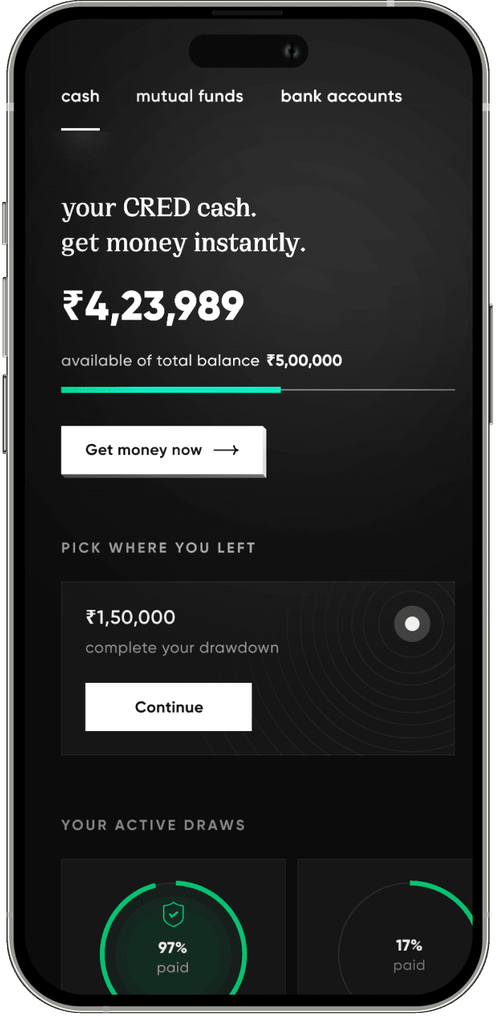
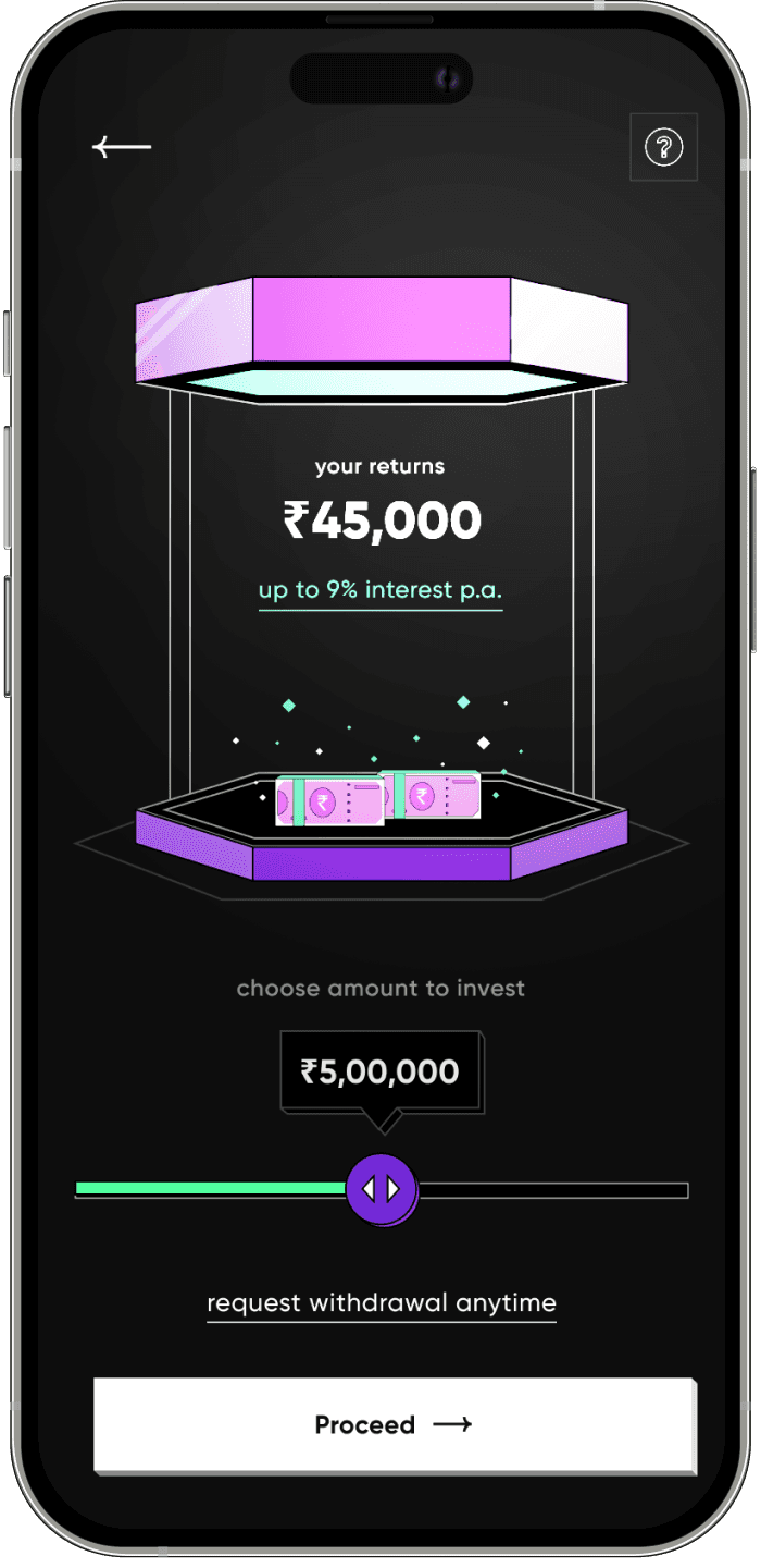
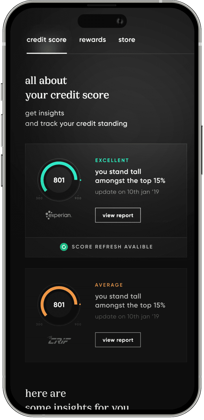
browser AUTOPLAY restriction
select the window • hover to play

my role
Lead product designer
our goal
Create a scalable design language that can last for the company's next five-year roadmap while maintaining the CRED's design team's reputation in the industry as a leader in the craft.
my team
11 product designers
04 motion designers
05 illustrators
CRED
a fintech & lifestyle super app catering to the top 01% of India
to establish context for our case study
A little
about everthing
overview
In 2020, the design world was all over the place, arguing about neomorphism in UI design. 🌎
That's when CRED came up with their all new look, "Synth" which was all about neomorphism. ✨
People either loved it or couldn't believe it, but one thing's for sure – it got everyone talking about design as art. 🎨
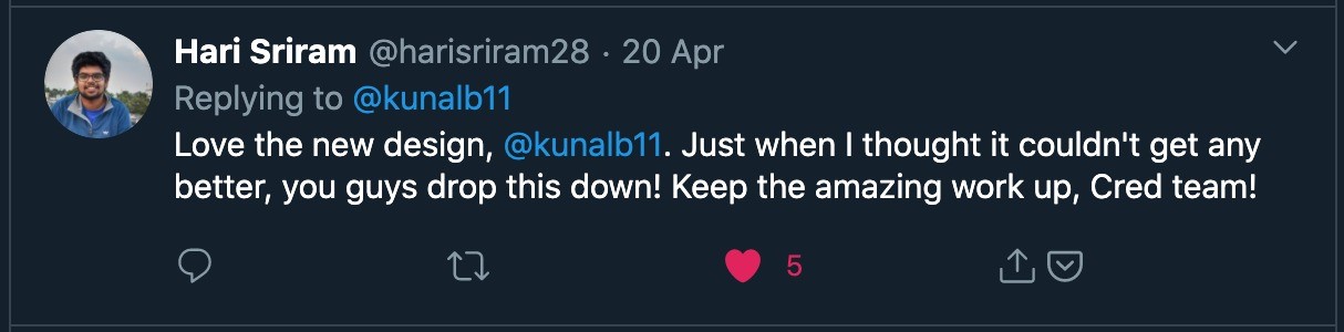
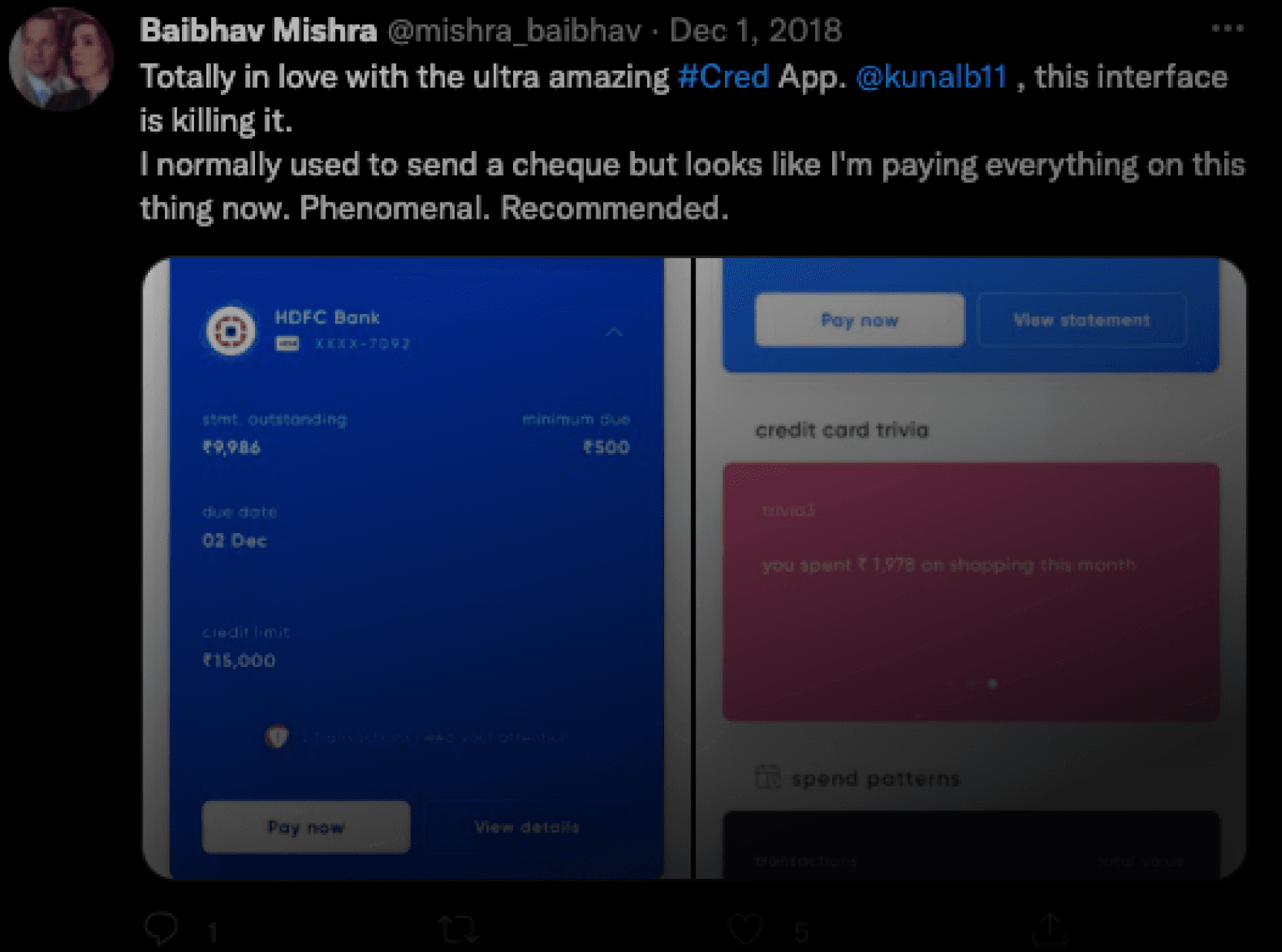
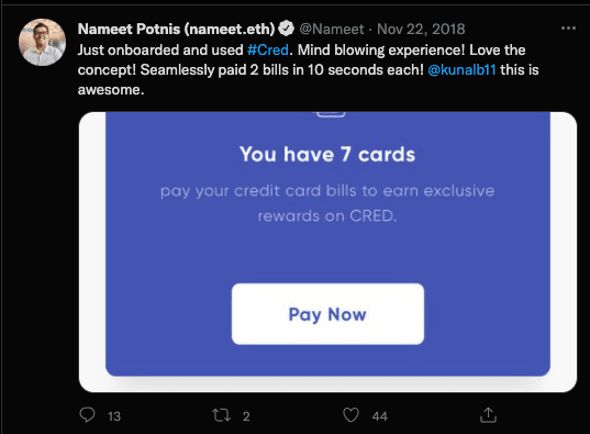

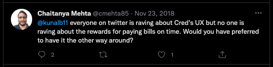

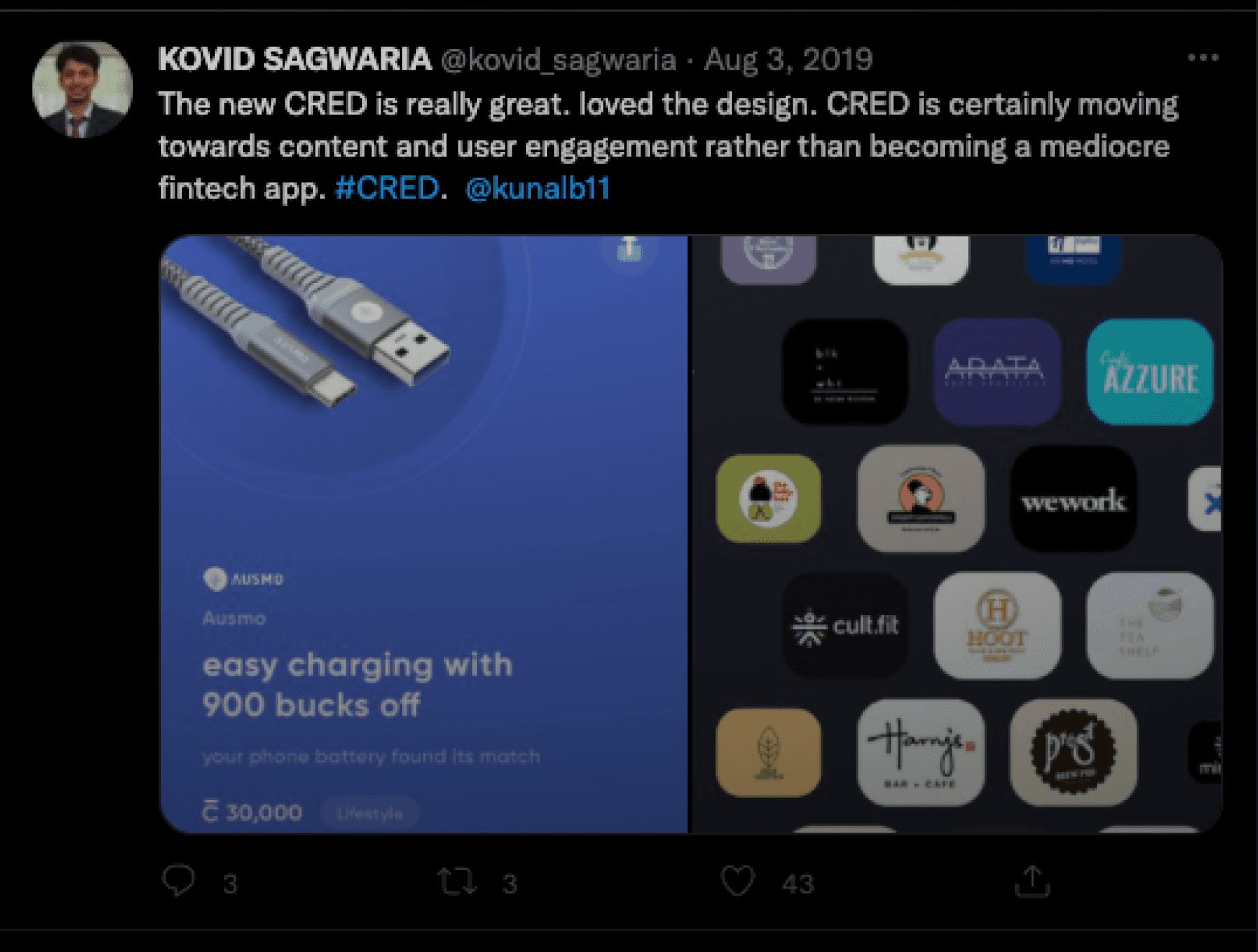

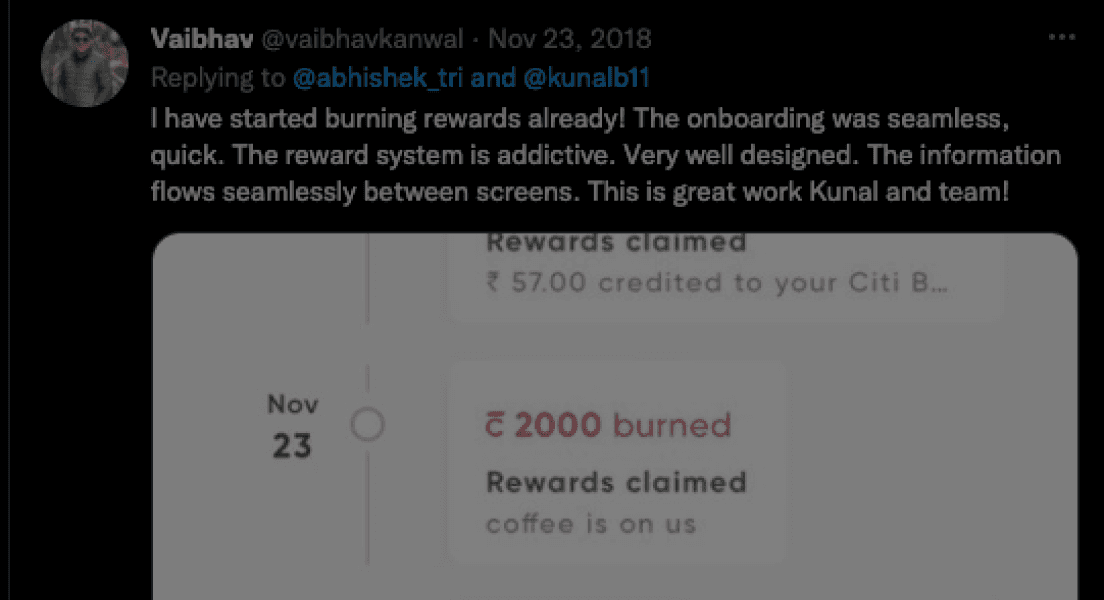
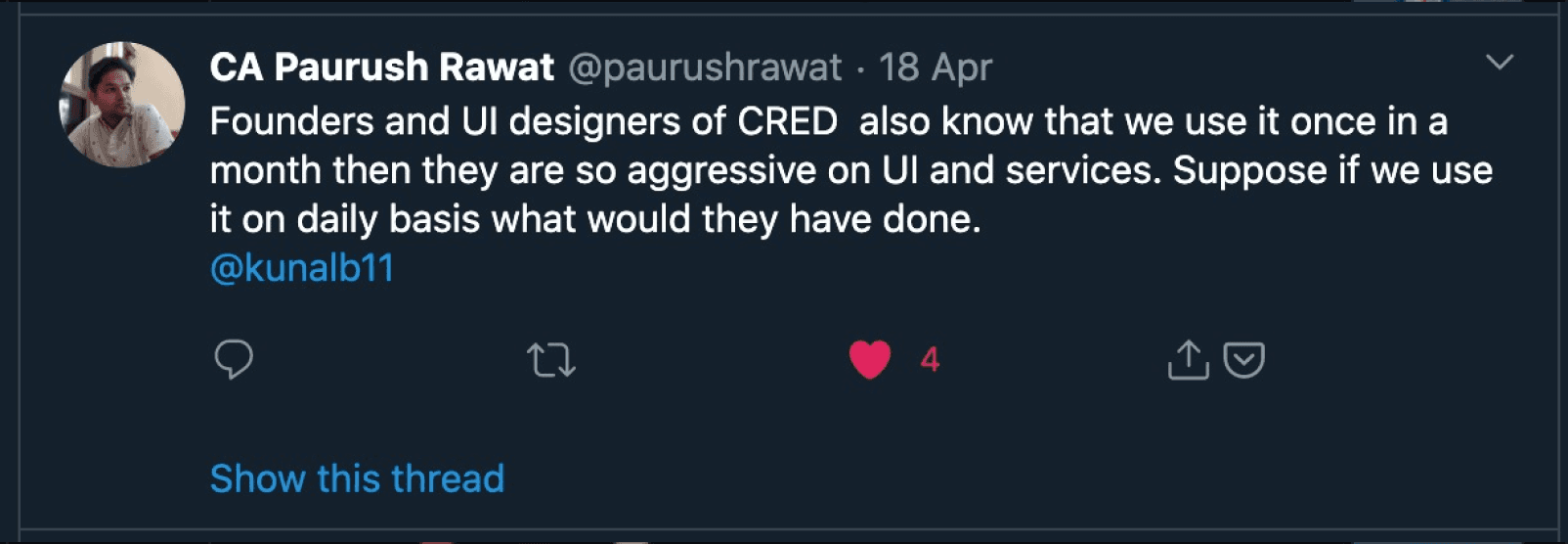
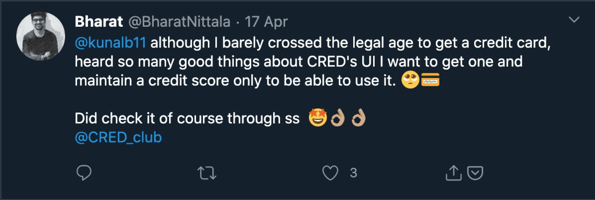
Back then, I wasn't part of CRED, but I was a design-is-art believer. 👁️
I was working on vanilla flows and craving something more innovative. 🧪
So, I joined CRED's design team, known as the "Design Mafia" in India. How cool is that? ♠️
Once I got into the mix, I realized that the amazing design language had some major scalability issues. 📈
With fresh funds and aspirational growth plans, we had to figure out our way forward as the design front. 💰
But then the COVID lockdown hit, making everything harder since we had to learn how to work together remotely. 🏠
But you know what? We went for it! ✌️
We started reimagining our design system during lockdown, pumped to shape its future for the better. 🚀
based on user research key insights, company growth plans & domain foresight
Tenets
we settled on
01
we analysed roadmap for the next 5 years that outlined the features we wanted to prioritize to keep us ahead of the competition.
04
we knew that introducing a learning curve for our users would inevitably result in a metric drop, but we were confident that this was necessary to ensure long-term success.
02
we recognized that our current language was not scalable and needed to be revamped in order to accommodate future growth.
03
we were determined not to drop the ball on our reputation as industry leaders in the craft at the cost of scalability
05
we recognized that some of our user experiences needed to be revamped to ensure they were future-proofed and aligned with our long-term vision.
06
we identified that our traffic was getting divided and confused across multiple paths of navigation. We needed to confine it to a single path and focus on optimizing it.
07
Finally, we understood that our home page was the first point of contact for users and that engagement was critical to retention. & As we move towards creating more transactional LOBs, we knew we will need to morph ourselves into that to improve the LTV.
discovery
by a team of visually driven designers
Bringing method to madness
conceptualization & craftmenship
1
2
3
4
5
6
7
8
9
0
1
2
3
4
5
6
7
8
9
0
%
project
progress
an individual
contributor

my role
As a new member of the team, It was expected that I would take some time to fully grasp the scale and complexity of the product.
we began gathering inspiration and creating mood boards to establish a visual direction & principles. 🖼️
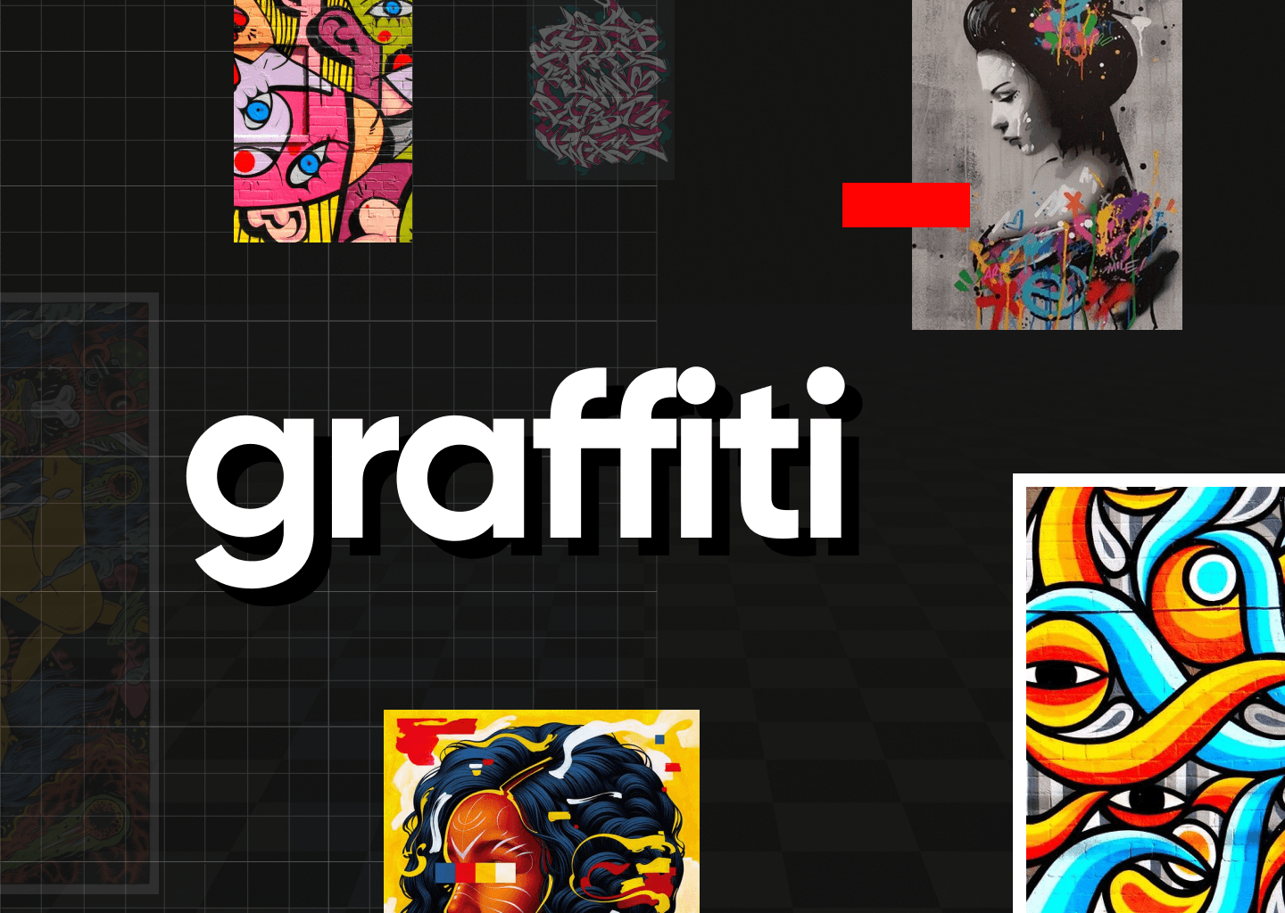
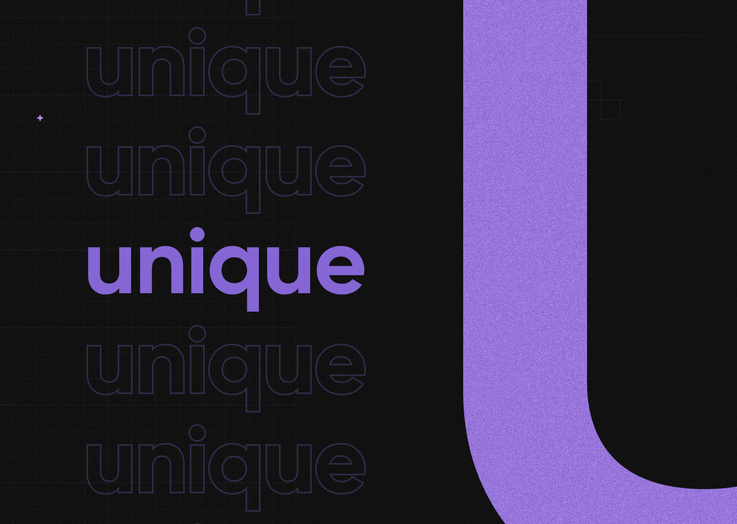
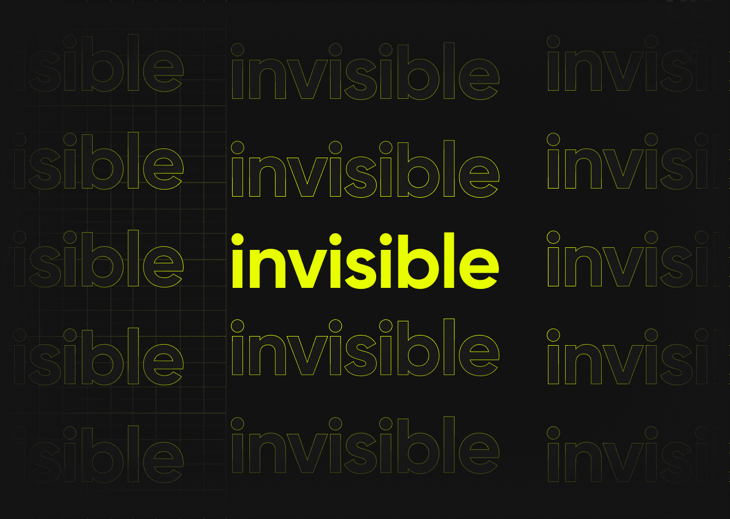
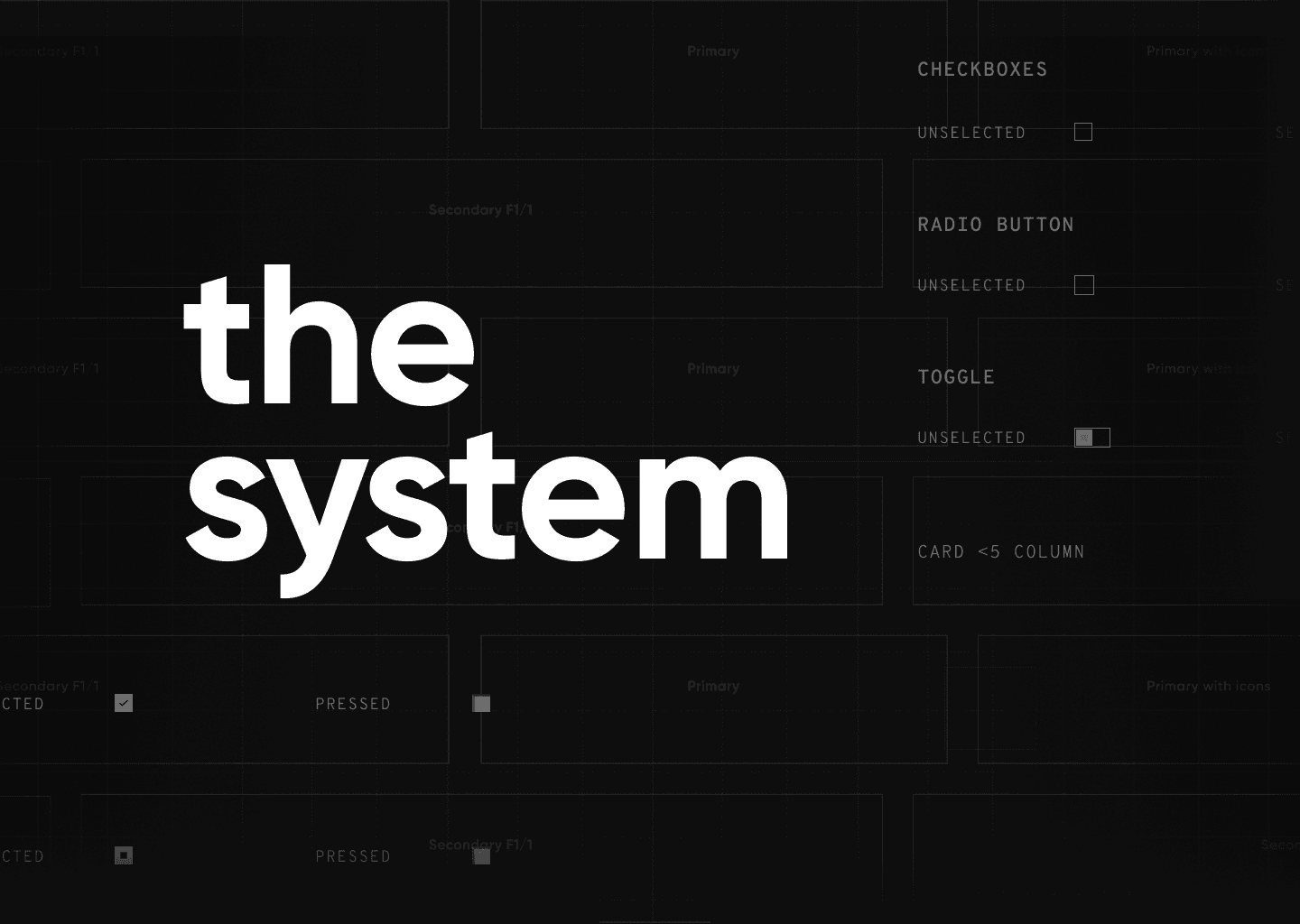

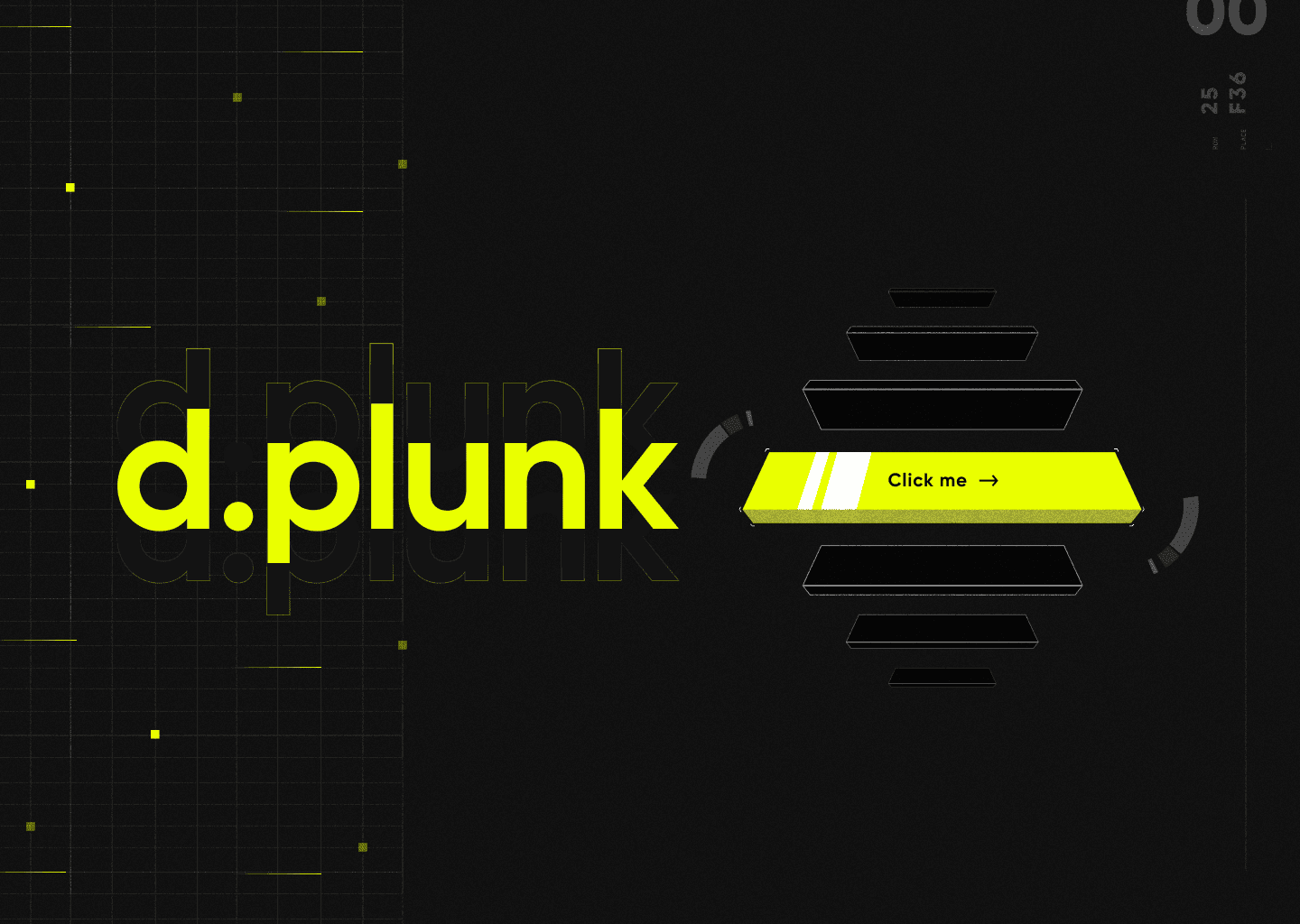
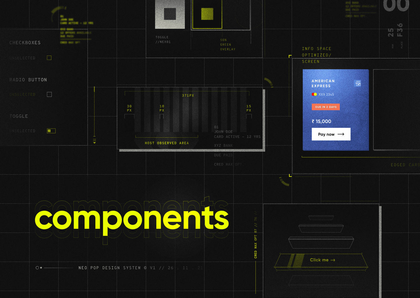
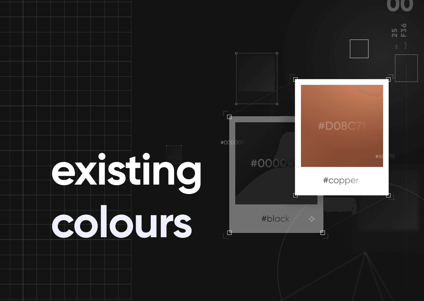
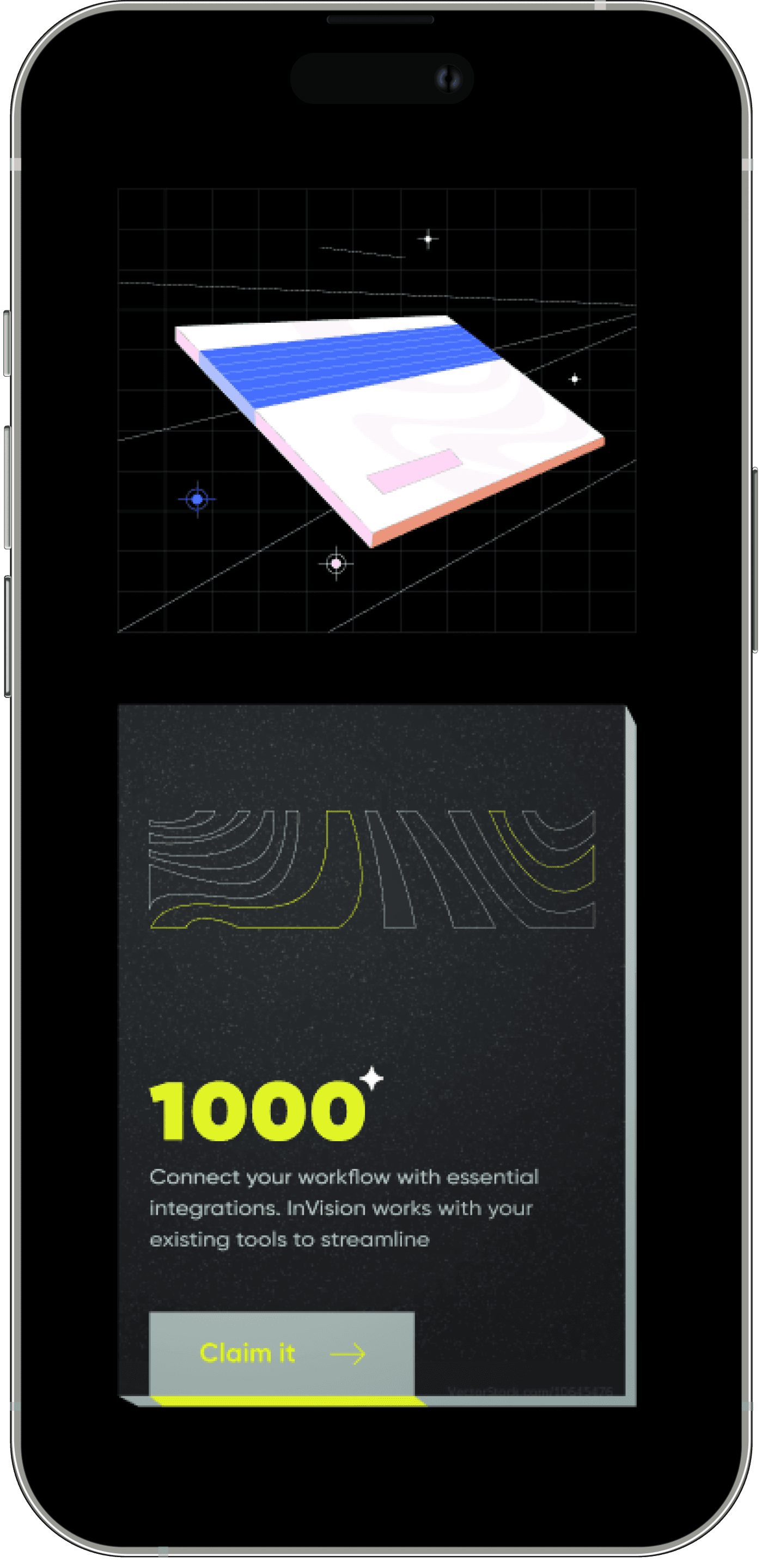
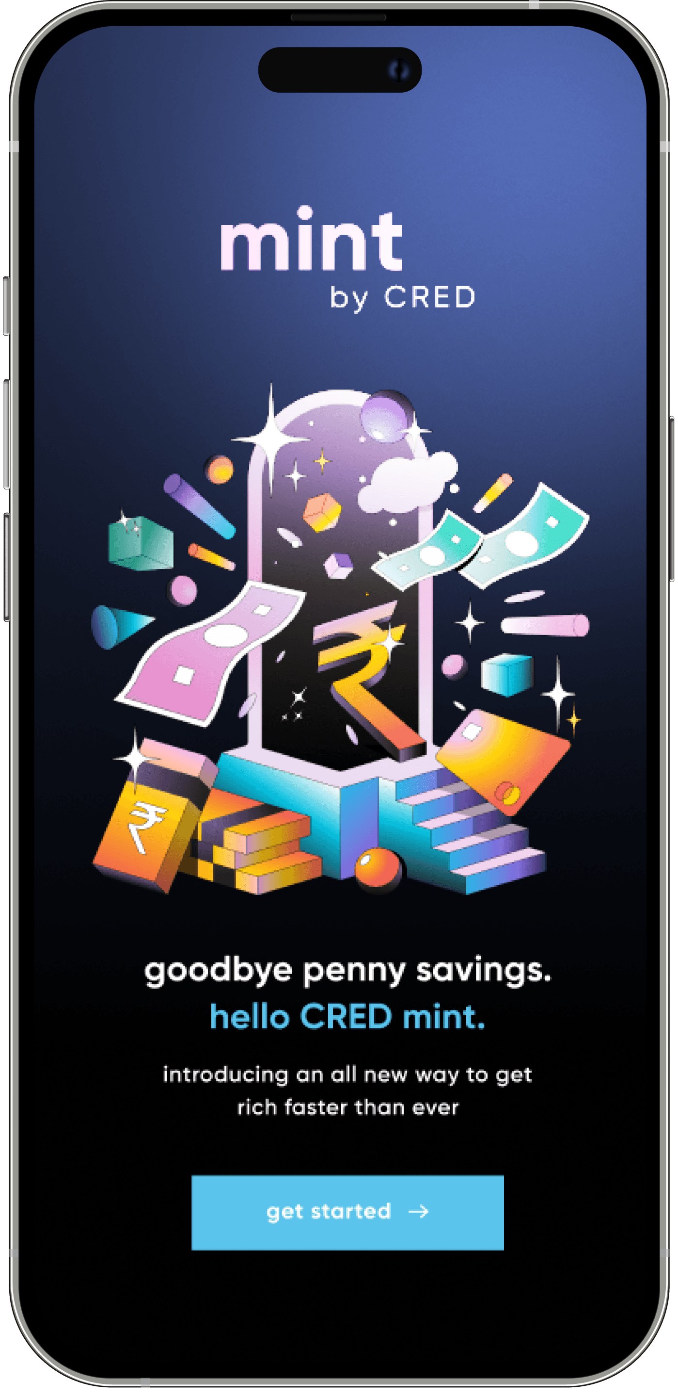
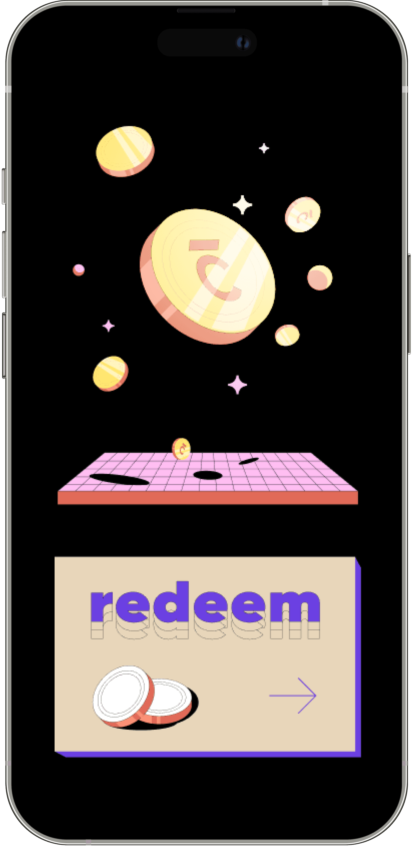
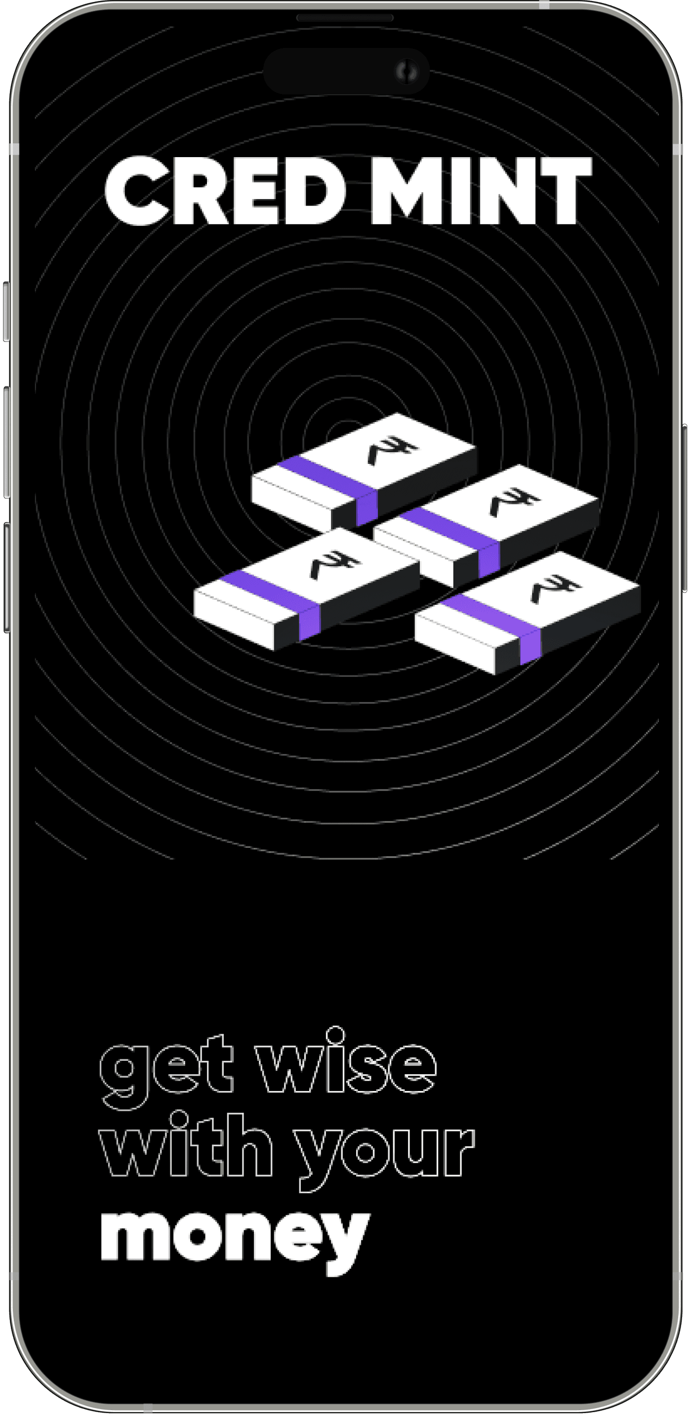
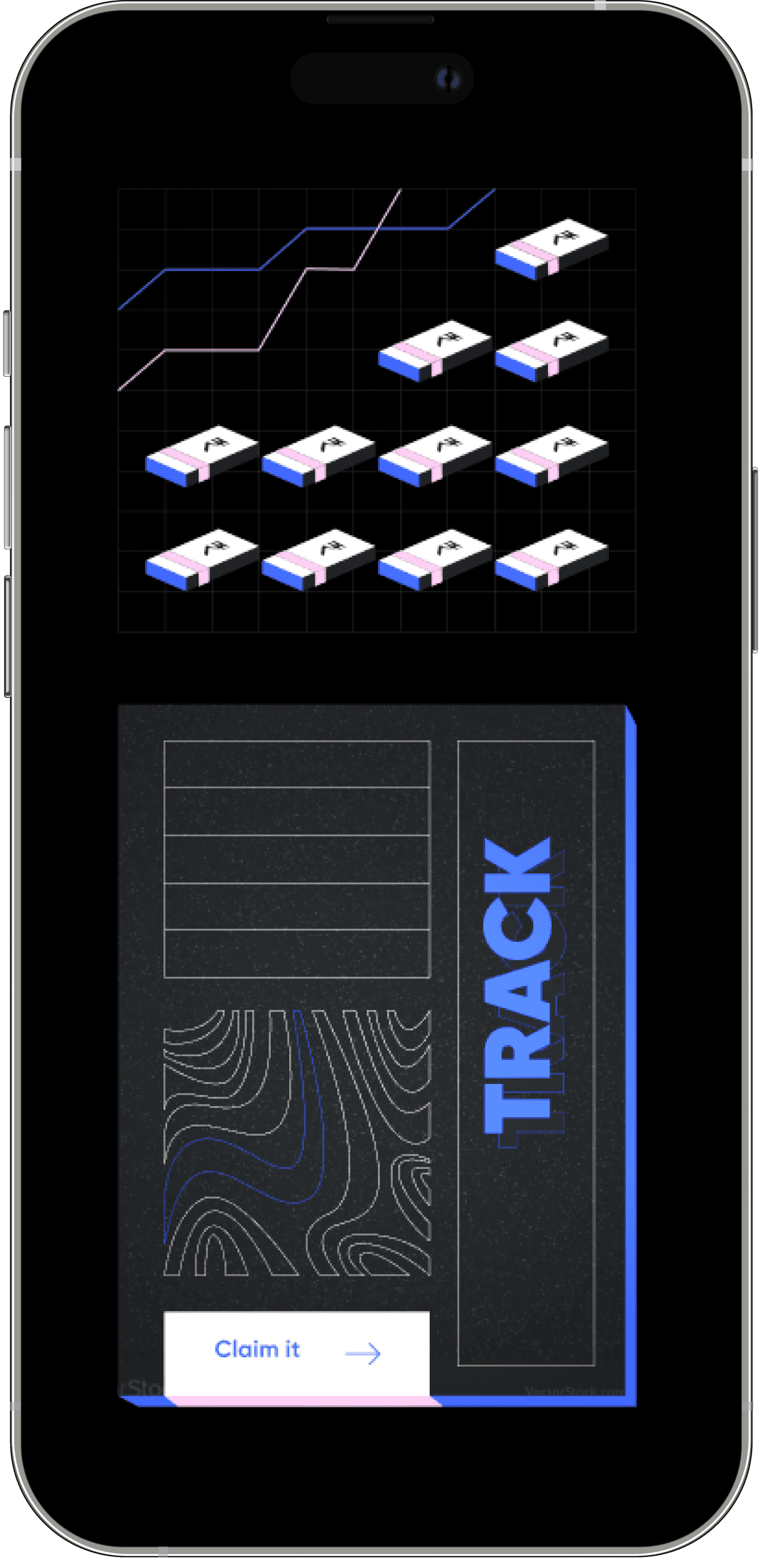
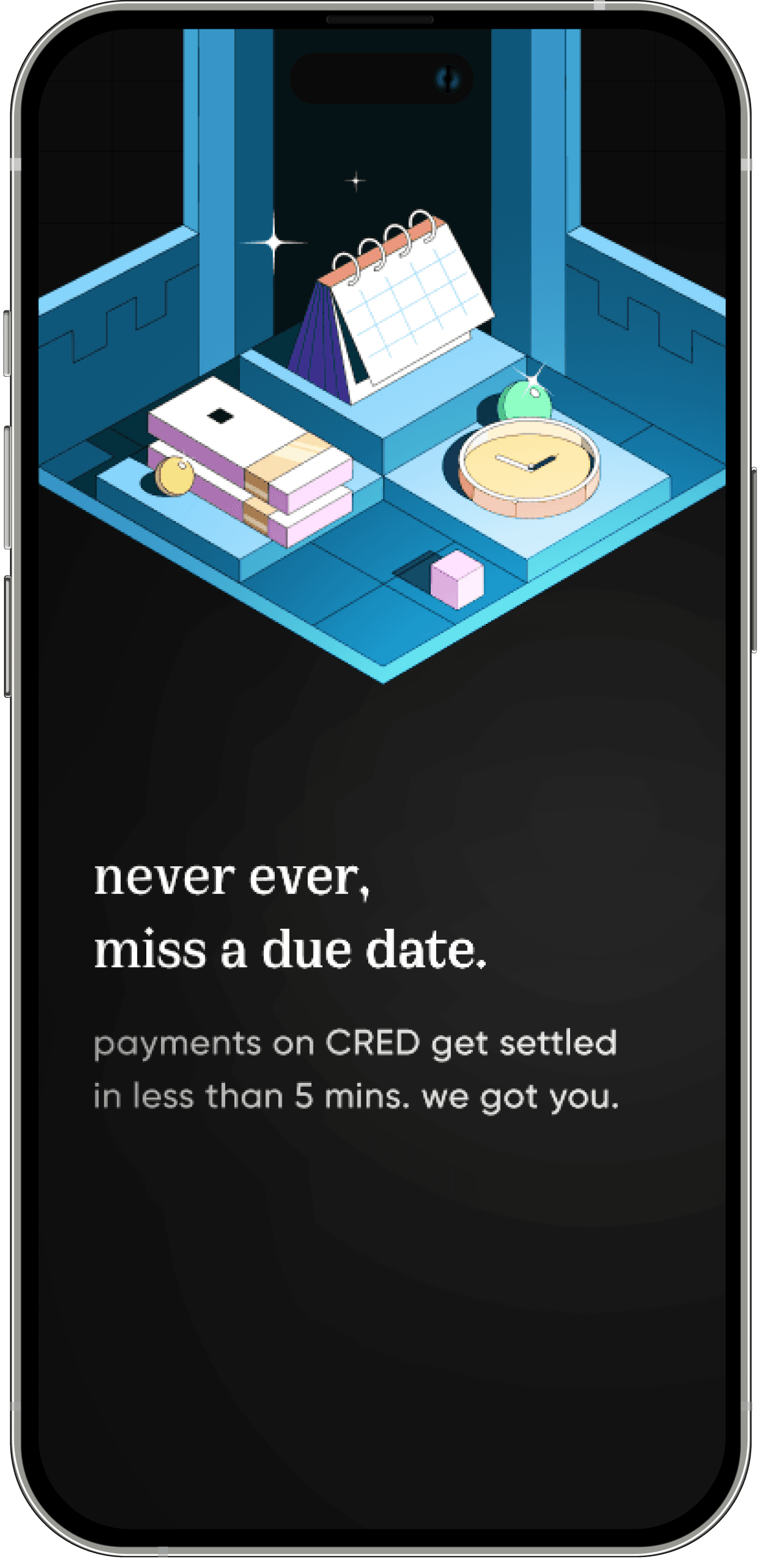
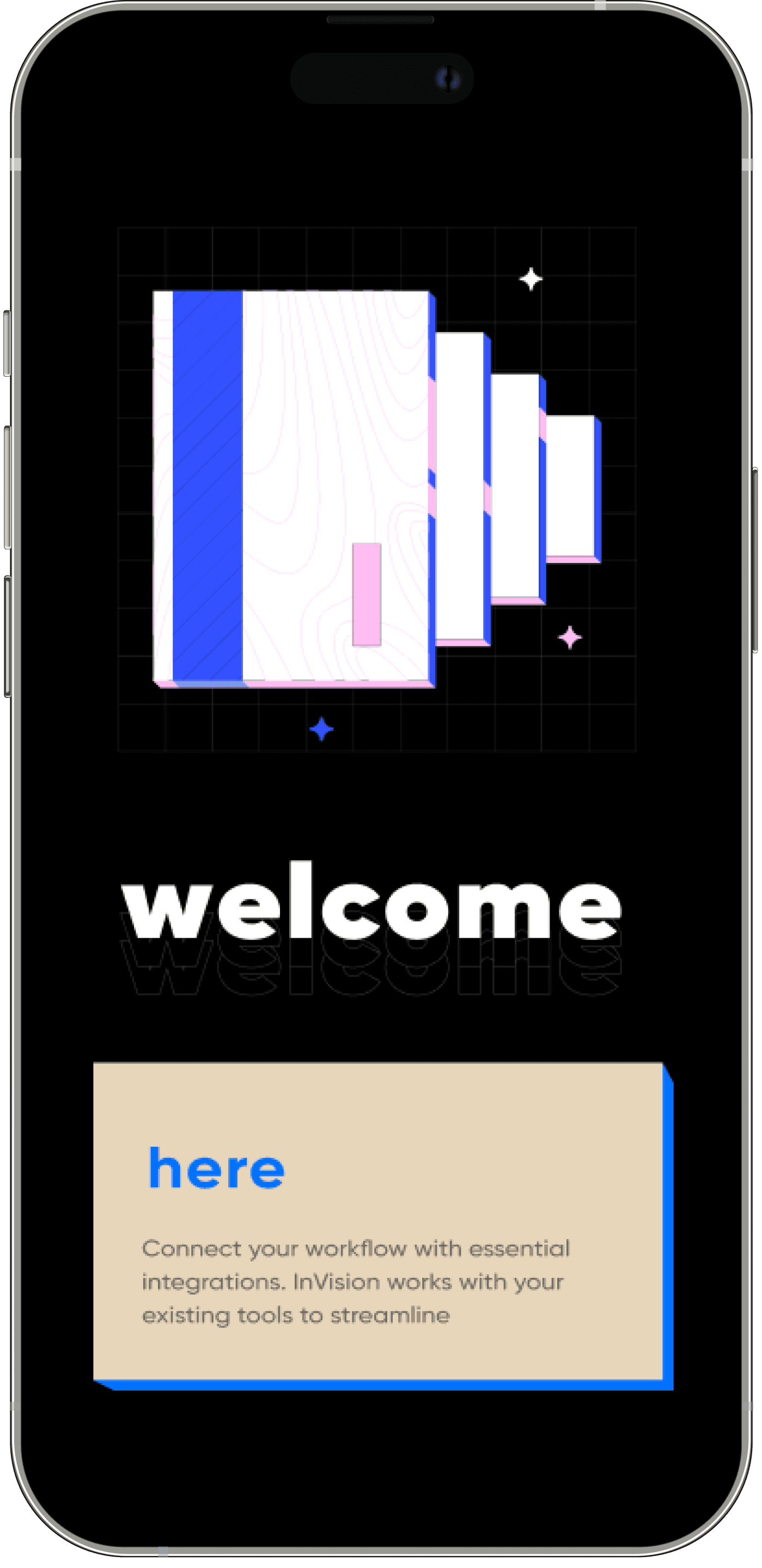
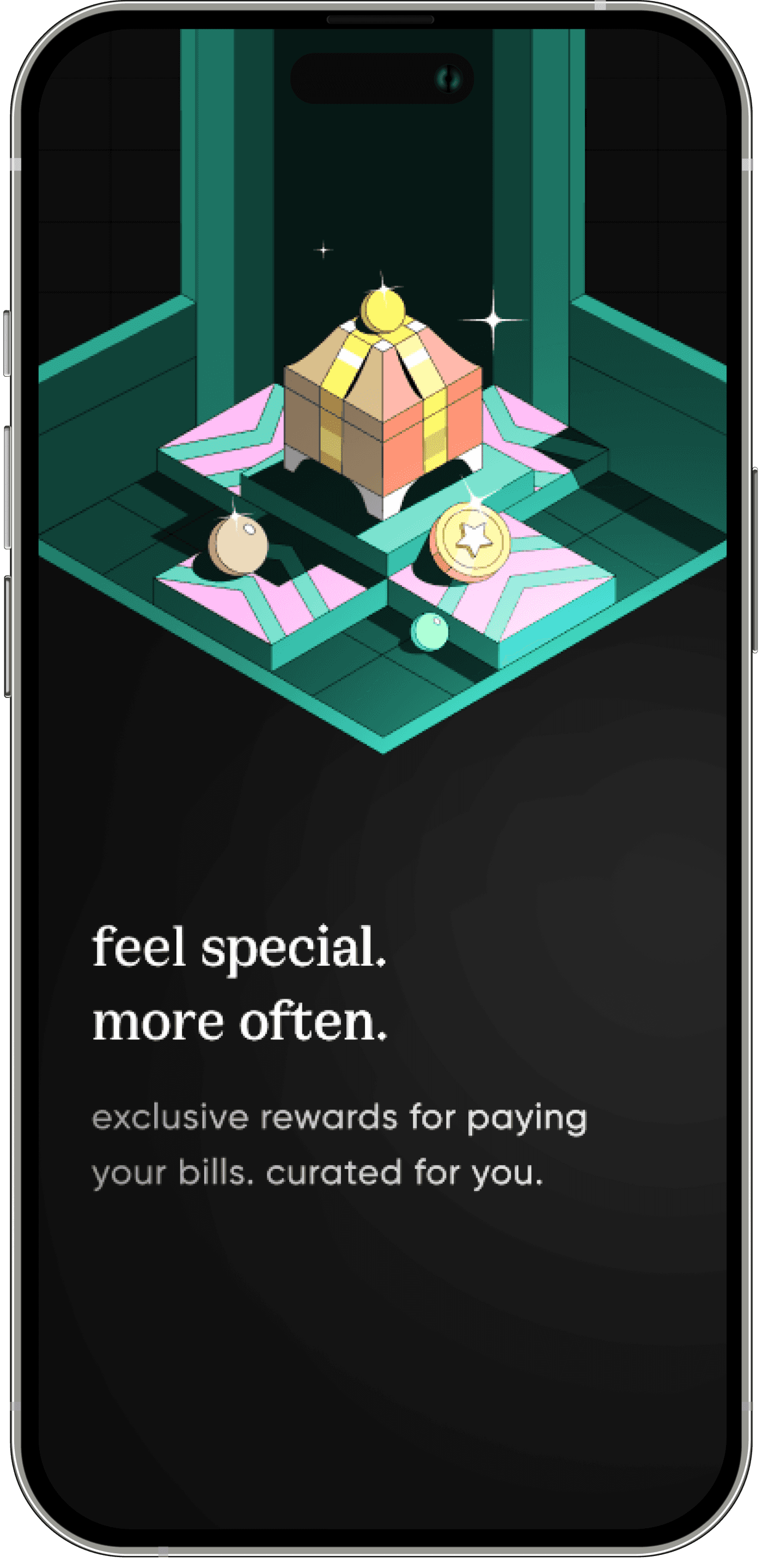
Through a series of visual explorations, we identified the few core unique elements of the product: a plunk/elevation, an uneven grid, a new serif font & more 🖌️
Our team of talented illustrators then came up with unique illustration styles and color schemes to bring our vision to life. 👩🎨
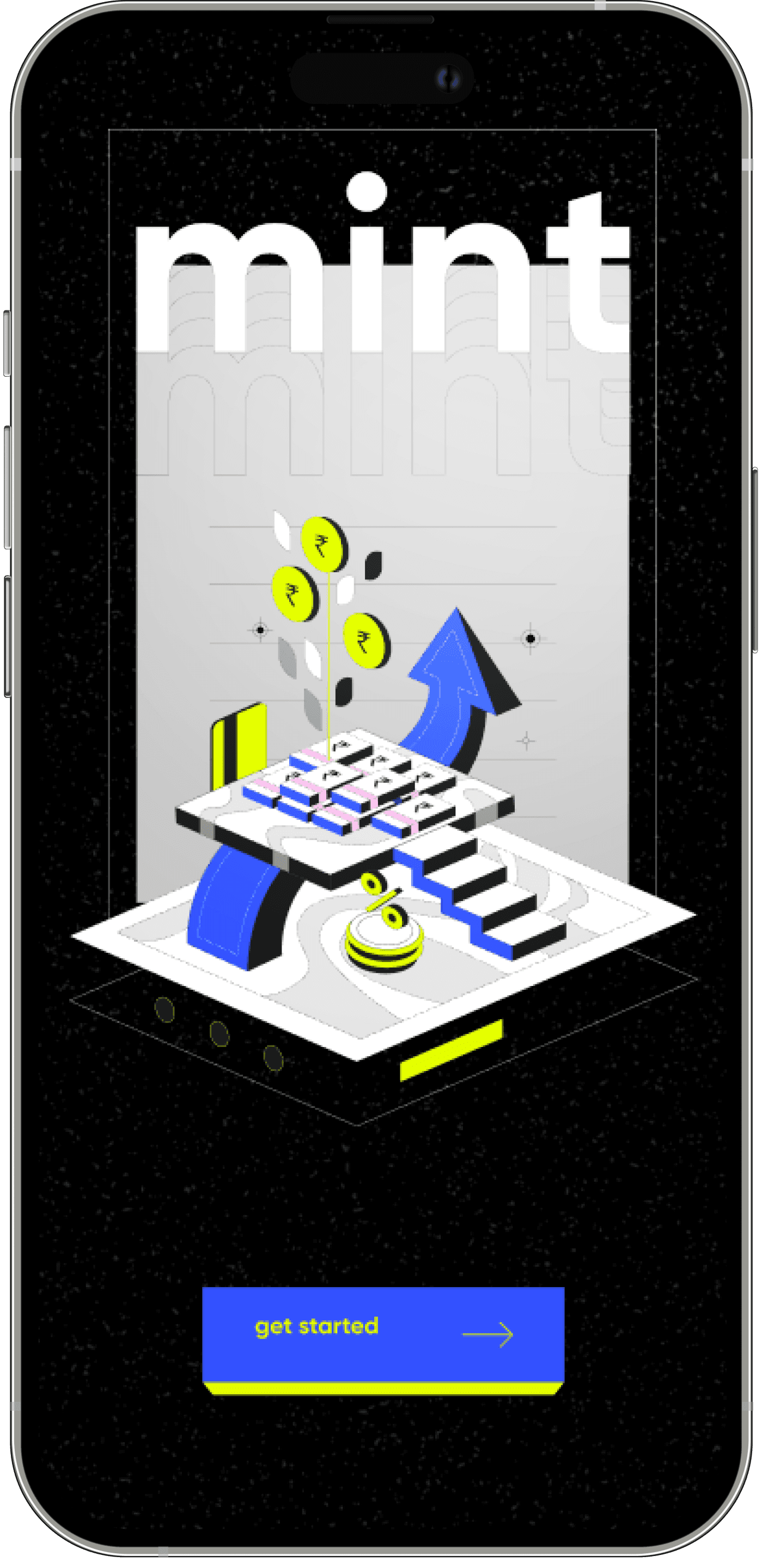

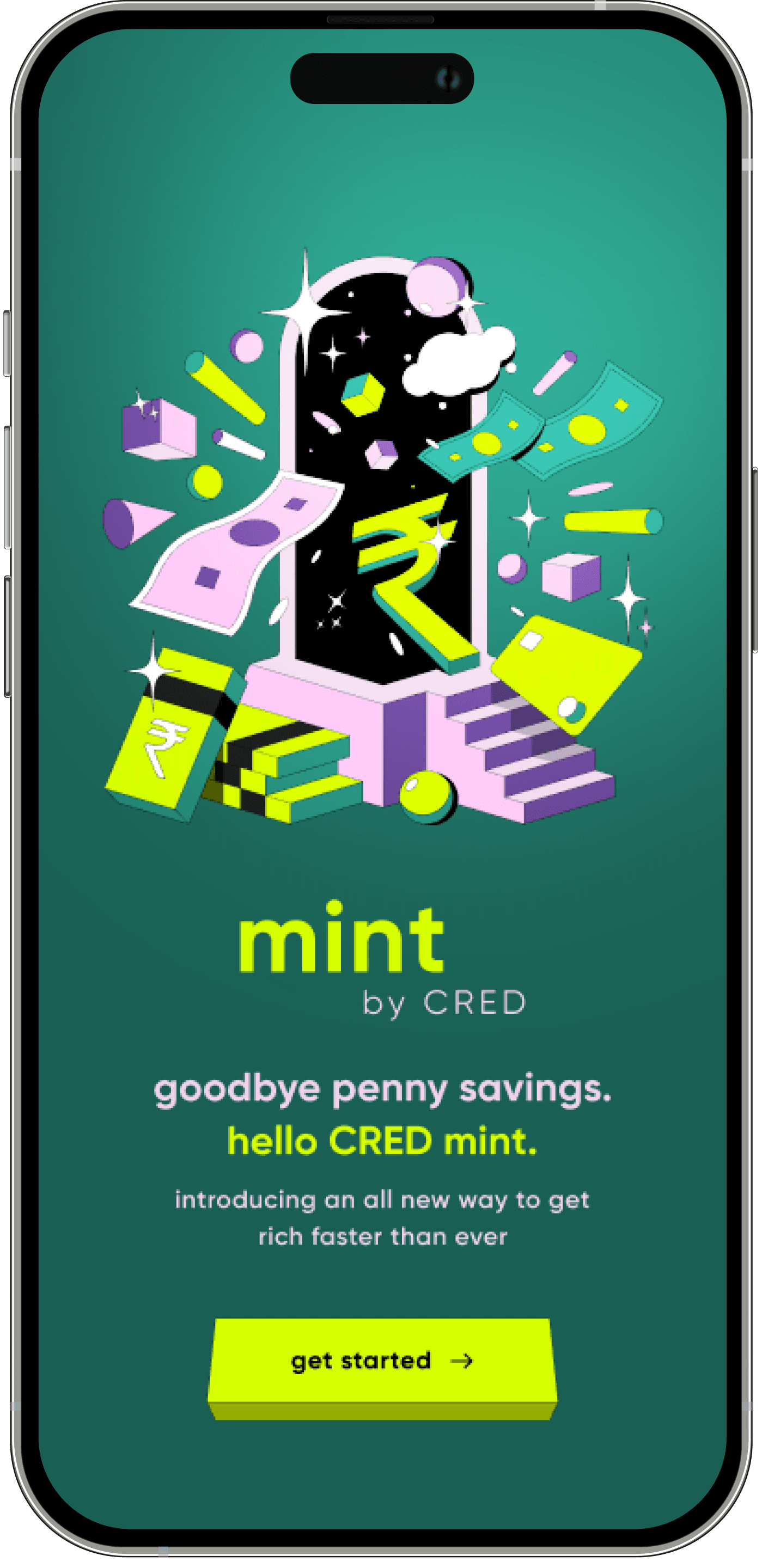
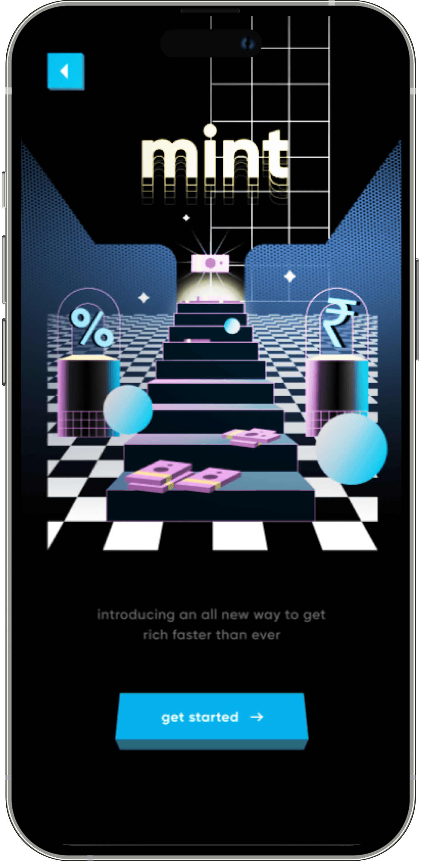
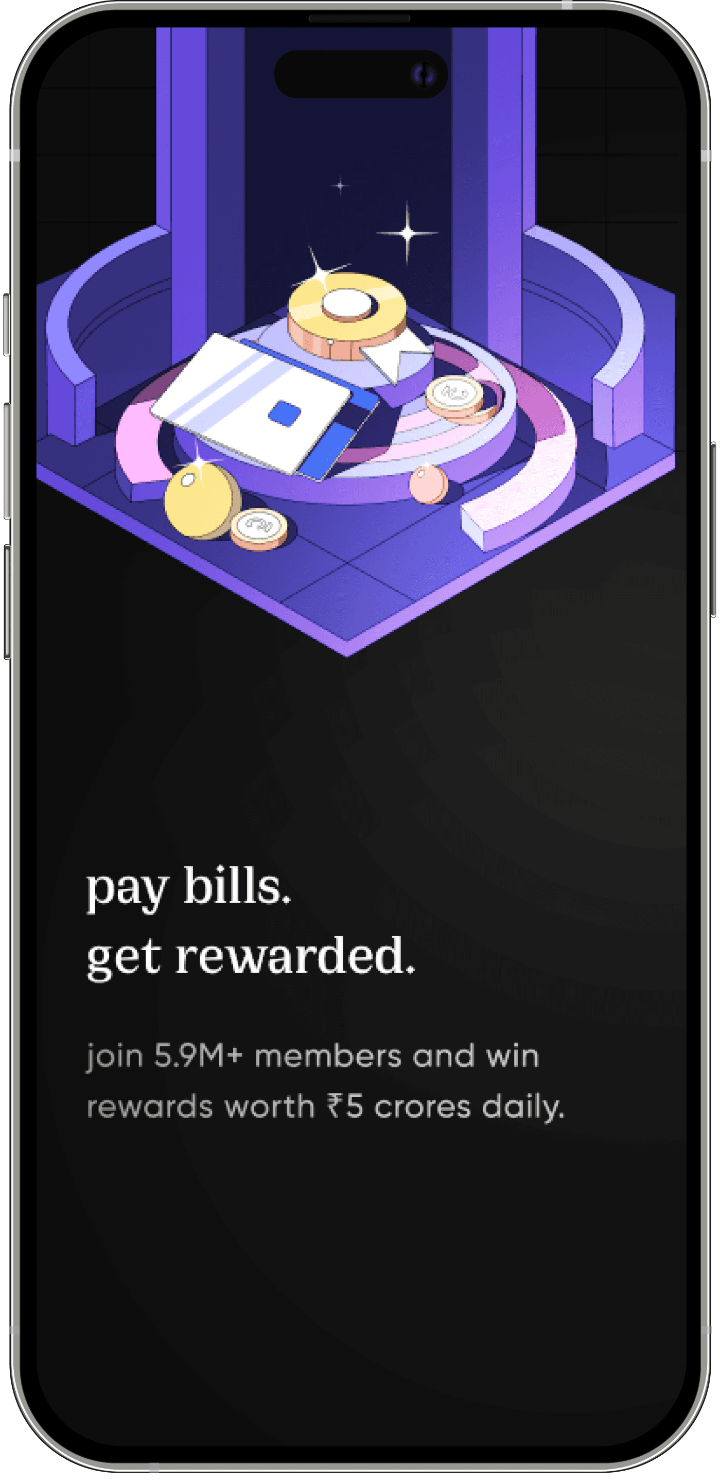
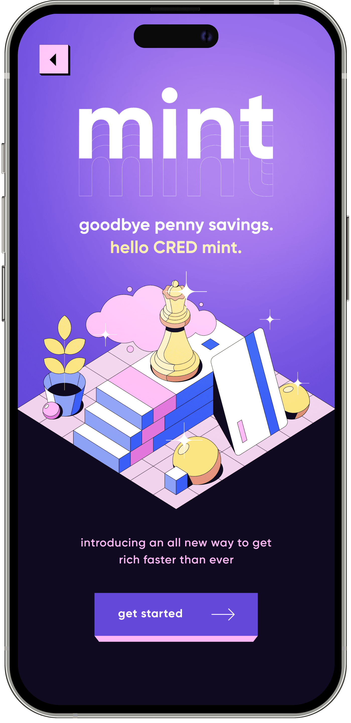
in the team structure
Something really cool happened
and then
1
2
3
4
5
6
7
8
9
0
1
2
3
4
5
6
7
8
9
0
%
project
progress
an individual
contributor
my role
As the project progressed, my contributions were increasingly recognized by the team. The Chief Design Officer approached me and offered me the responsibility to lead the project
With this came old challenges with a new neck to hold, mine. 🥲
As a lead designer, I had to collaborate with over 20 designers in a remote setup, which was no small feat. 📆
Additionally, there was a lot of pressure to maintain the team's reputation by delivering a final output that was nothing short of exceptional. 📺
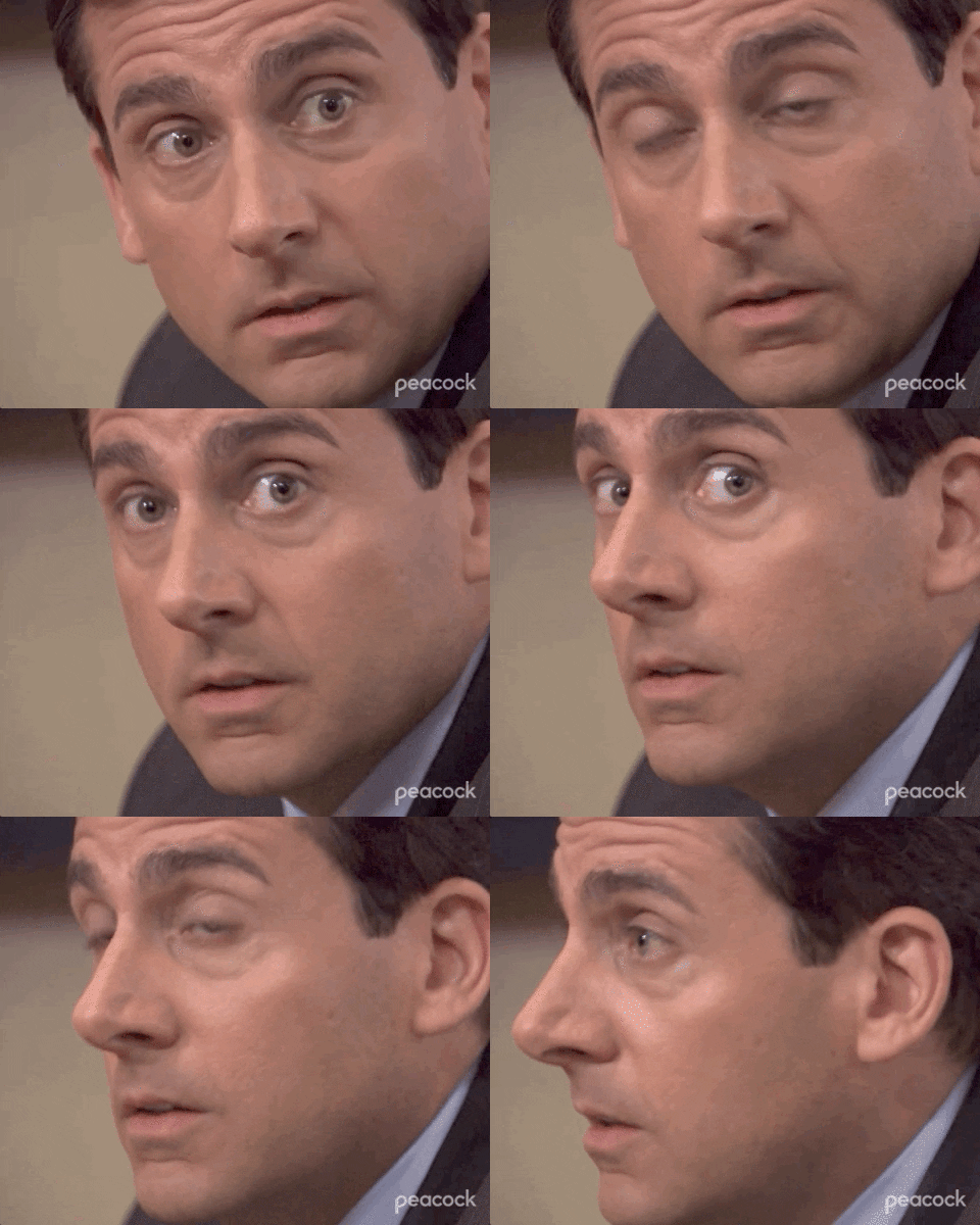
My success hinged on defining a cohesive design language that could scale across 15 different LOBs, each with their own unique financial and lifestyle components. ⚙️
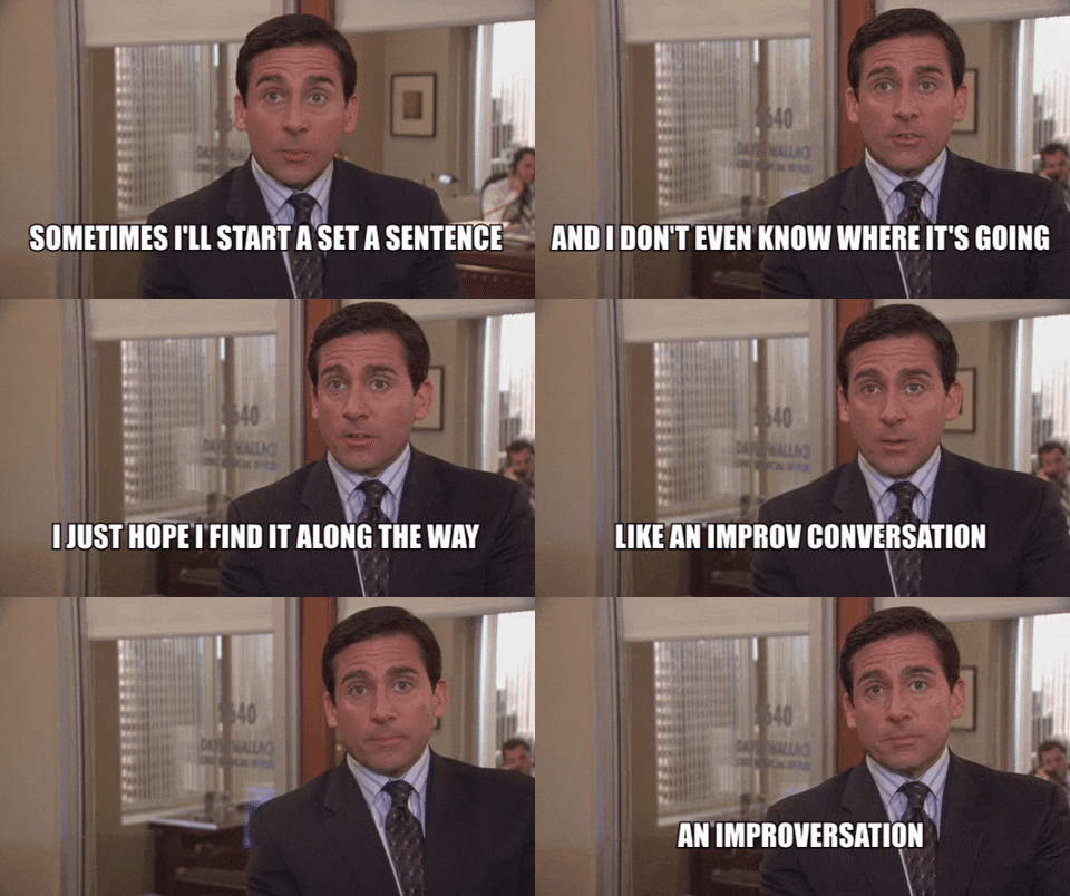
basically,
no pressure. 🙃
Kidding; I enjoyed being in this position. 😄
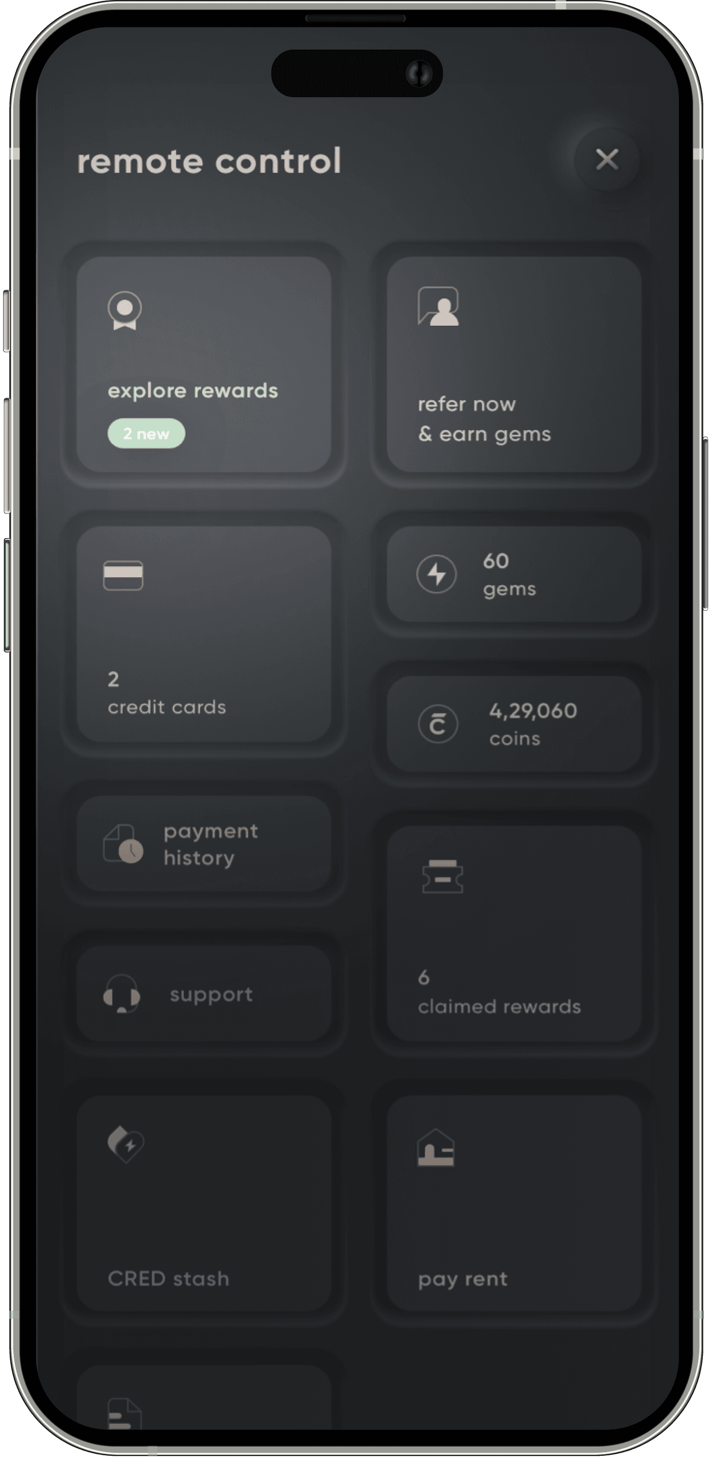
To keep the user experience in sync, I designed all the landing experiences personally & also created 'Soul Sorbet', our bespoke hand crafted interaction design system. 🪄
browser AUTOPLAY restriction
select the window • hover to play
something that my CDO said when I joined stayed with me,
No one knows everything, and whatever we don't know we'll figure it out together. 🤝
so a million frames later.
we figured it out, together. ❤️
handling feedback, expectations & anxiety across the system
Collaboration with product & business teams
feedback
We also did floor testing for most of the designss. This allowed us to test our designs in real-world scenarios and make necessary
adjustments
before finalizing
the product.
we took in feedback from all stakeholders and conducted demos to evangelize our new design language across various teams, including product, business, customer service, leadership, and campaign teams
anxiety
we encountered some anxiety from the financial product team, who were concerned about the impact of the navigation changes on their top-of-the-funnel metrics. This was a reminder that we needed more champions than challengers within the system.
For core spaces where people felt anxious, we didn't engage in subjective debates without data. Instead, we created fallbacks that brought confidence back into the room and showed that we had answers to fall back on if things went wrong.
By taking feedback, conducting demos, and creating fallbacks, we were able to create a final product that met the needs of all stakeholders while maintaining our cohesive design language. It was challenging, but by working collaboratively and embracing creativity, we were able to achieve a successful outcome.
fin
refinement
& we did it in style at the 3rd anniversary of CRED
It was time to show it to the world
final reveal
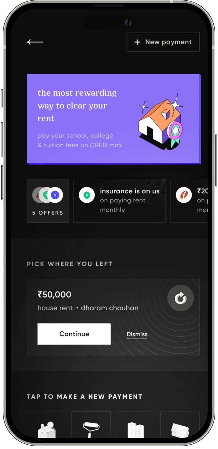
the genesis of all journeys
Home
01//
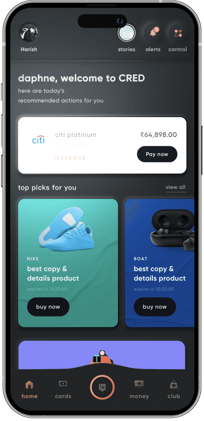
These changes allowed us to transform the home page into a powerful tool that not only improved the user experience but also drove business results. By understanding the critical role of the home page and making data-driven decisions, we were able to deliver a product that exceeded expectations.
fin
We recognized that this was a critical element of the user experience, as all users landed on this page first. It was essential that we did a great job of sending users to the right place, both those coming with intent and those without.
We prioritized showing all financial lines of business that required top-of-mind attention for conversions to 100% of users upfront. Additionally, we ensured that all upcoming payments were shown upfront, which not only improved the user experience but was also great for business.
To make the home page even more engaging, we developed better and more engaging widgets as compared to banner blindness. And to ensure personalization, we integrated data science to provide a personalized homepage for every user.
browser AUTOPLAY restriction
select the window • hover to play
unified navigation for every user
Pinnacle
02//
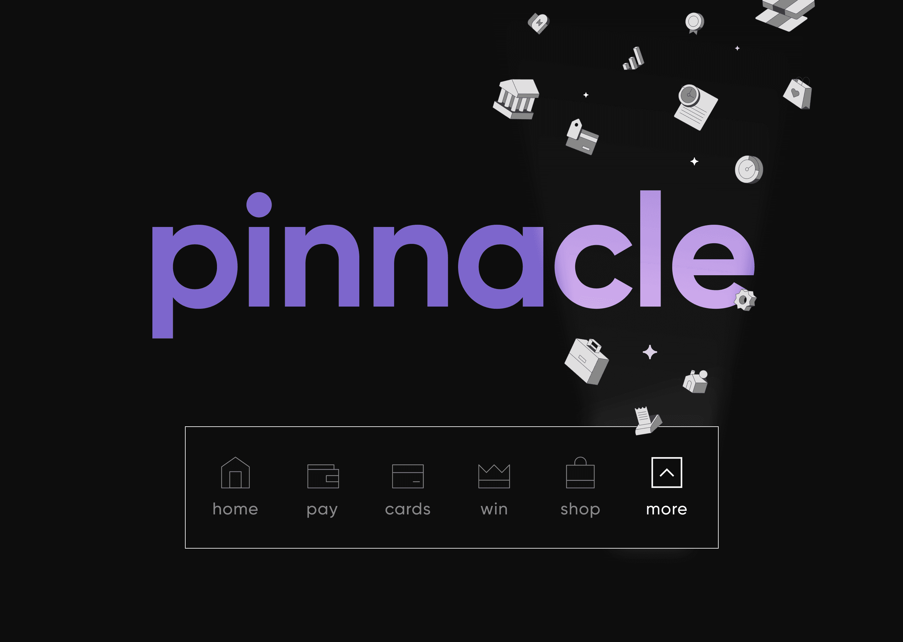
we focused on creating a unified navigation system that was not only functional but also beautiful. We wanted users to experience beauty in every tap, so we paid close attention to the iconography and made sure that it was both beautiful and accessible for all users.
all your credit cards at your finger tips
Cards
03//
contextual
CTAs
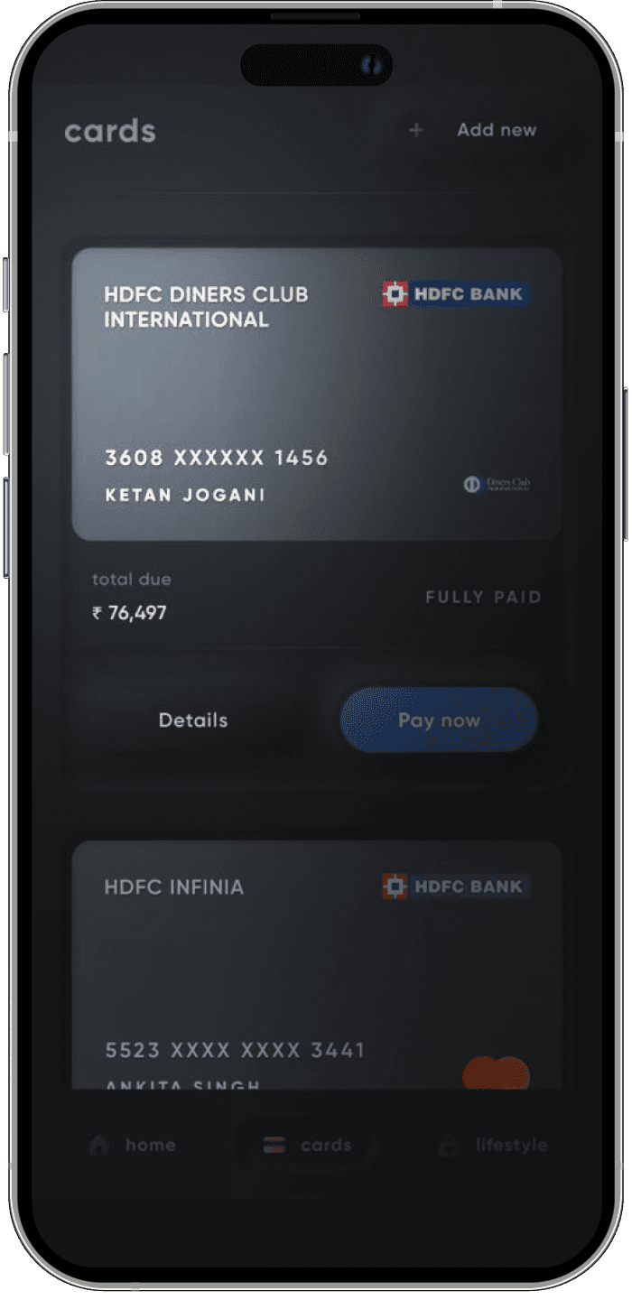
the most loved feature since inception. This was a critical element of our product, and we knew that we had to get it right. We ensured that all cards looked like actual cards, which was a small but essential detail that added to the overall user experience.
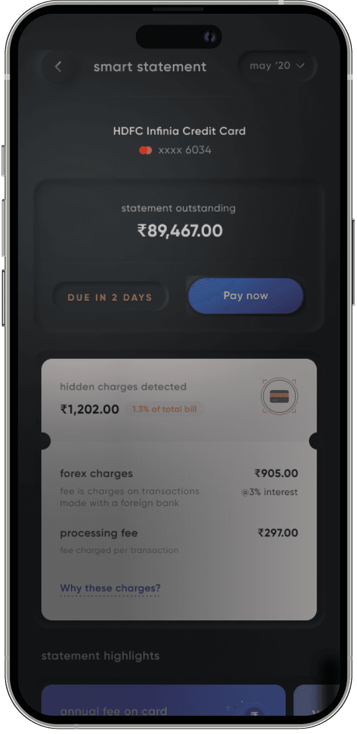
The overlays provided users with states around the billing cycles, which helped users to stay on top of their finances. We also added CTAs with triggers, which helped to create a sense of intrinsic motivation and encouraged users to take action.
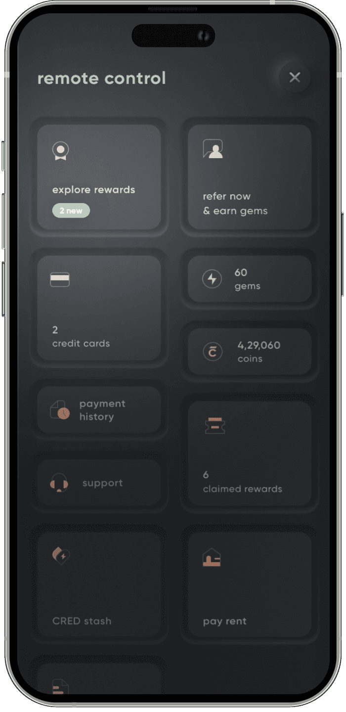
To make the credit card management system even more accessible, we ensured that all key actions were in one place. Users could access everything they needed to manage their cards in one centralized location. We also created a smart statement system that helped users to understand their spends and manage their finances more effectively.
browser AUTOPLAY restriction
select the window • hover to play
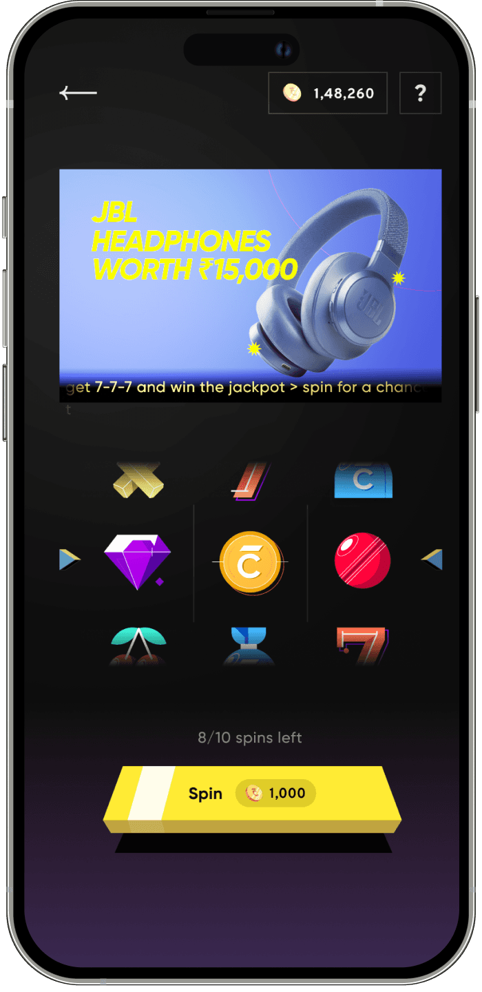
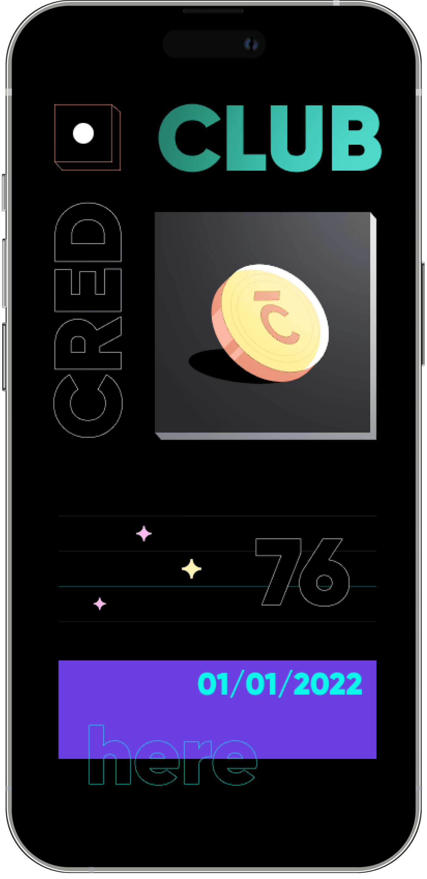
The in-app cred coin casino
Win
04//
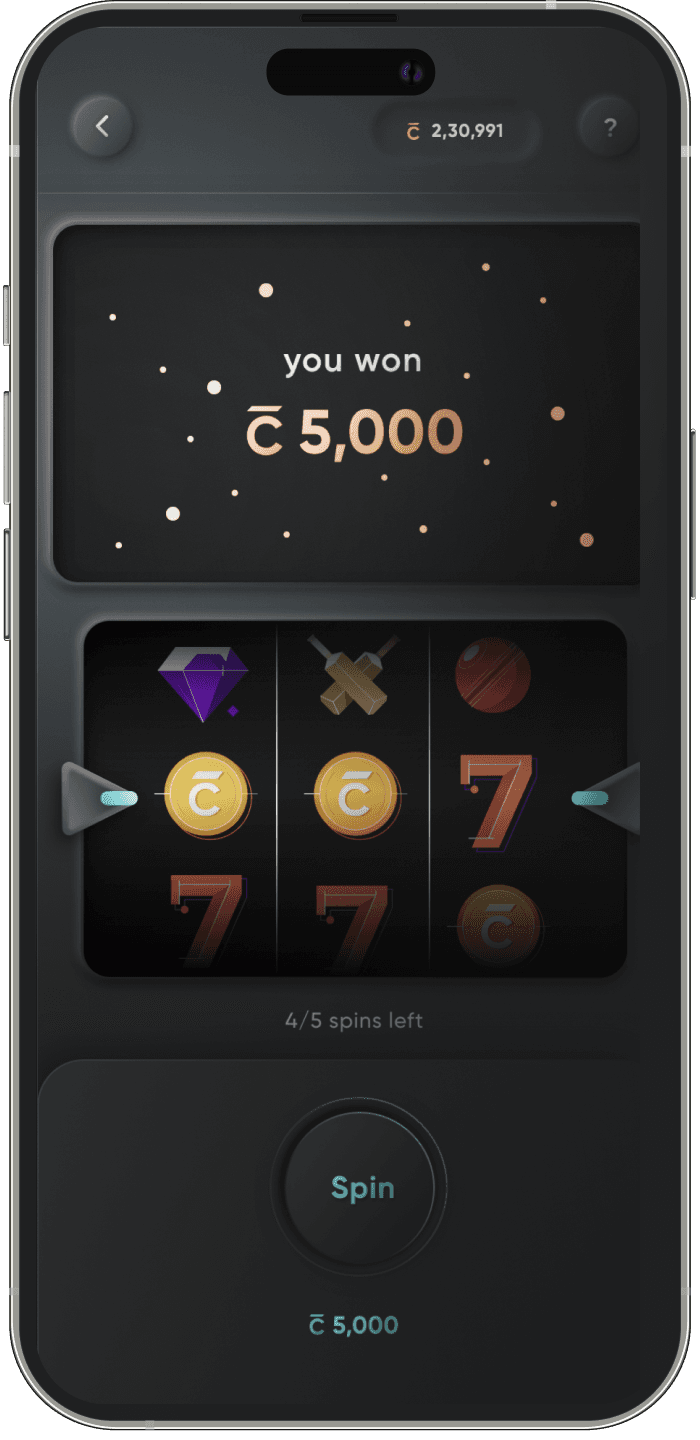
To make the win charter stand out, we focused on motion orchestration supremacy. We wanted the hero of the page to look like one, and we made sure that it was visually stunning and engaging. We also implemented social proofing in every section to create a bandwagon effect, encouraging users to engage with the casino and the cred coin burn loop.

browser AUTOPLAY restriction
select the window • hover to play
everyone's favourite deal store
Store
05//
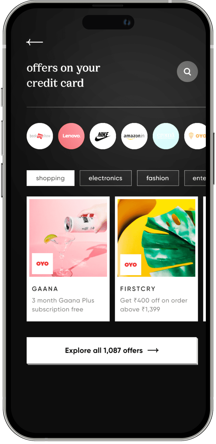
a discovery-based e-commerce platform that brought users the best deals using their coins. We knew that we wanted to create something unique, something that wasn't just about buying products but also about acquiring them.
To achieve this, we approached the design of our store differently. We celebrated the acquisition of products and focused on making every product look beautiful. This attention to detail made our store one of the most beautiful e-commerce platforms you'll see.
Our store was also known for its direct-to-consumer (D2C) product discovery, which made it easy for users to find new products that they would love. We achieved this through personalization based on user data, which was integrated using data science.
browser AUTOPLAY restriction
select the window • hover to play
beyond metrics, it was a hit in the design community! 🎉
We were able to ensure there was no regression in metrics & have some big wins
Results after 6 months of launch
2.2x
2.2x
1.3x
discovery of new LOBs
pinnacle/navigation
scroll
depth
2.2x
2.2x
2.2x
home
time
spent
1.6x
1.6x
1.6x
home
top of
the funnel
1.5x
1.5x
1.5x
fin lobs
impact
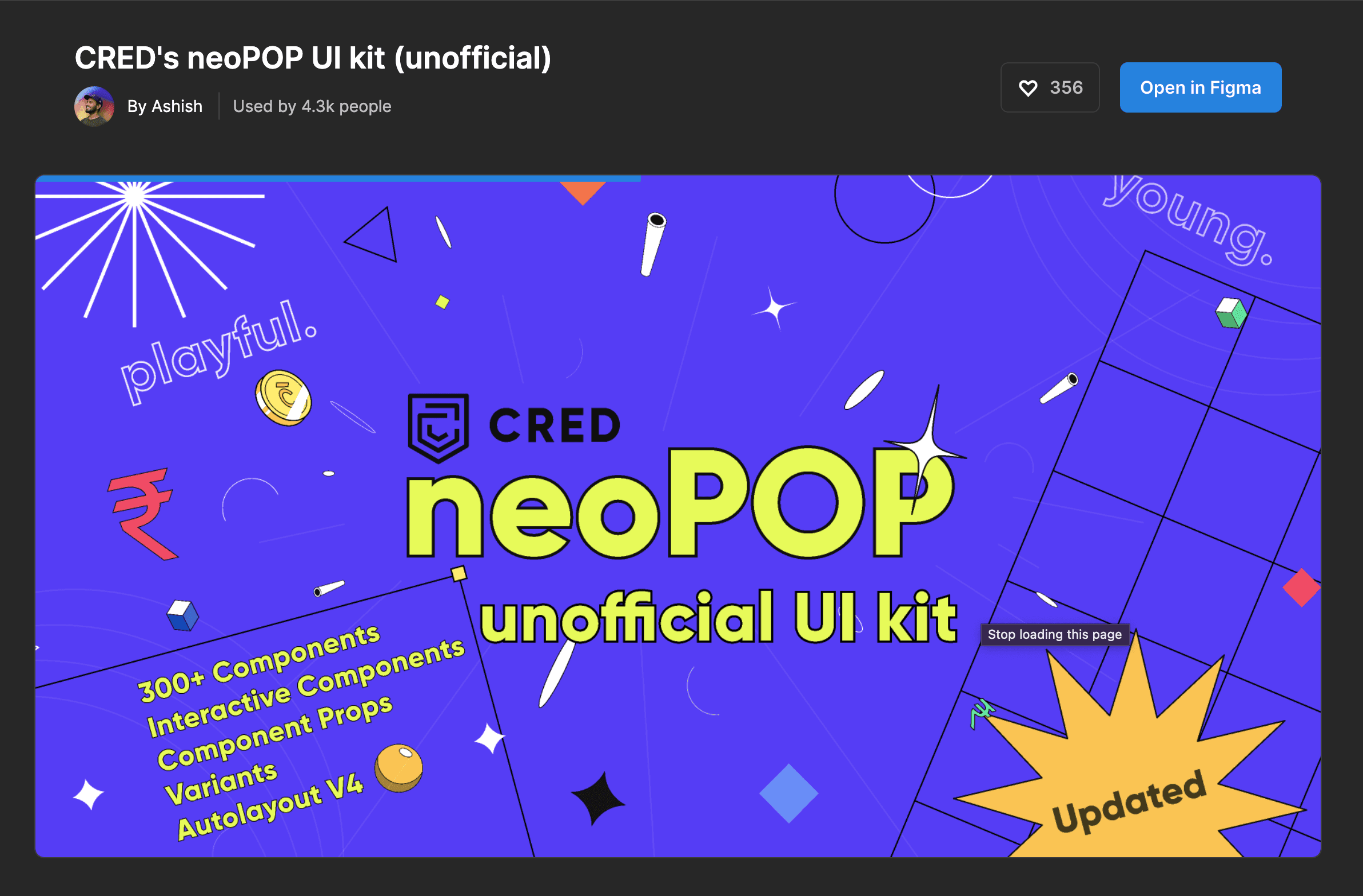
someone took screenshots of the whole app & released an unofficial design system on figma community. 🫂
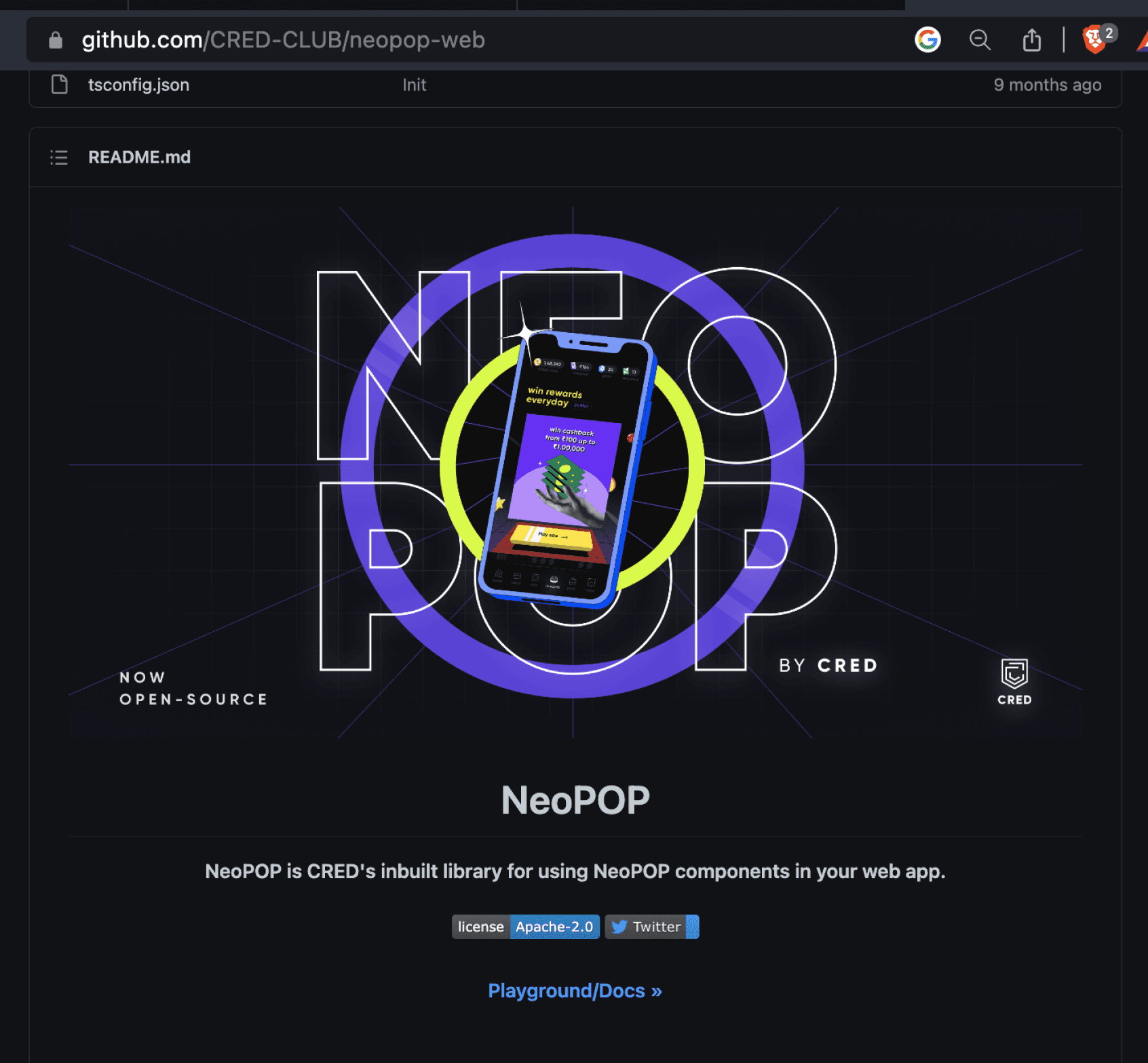
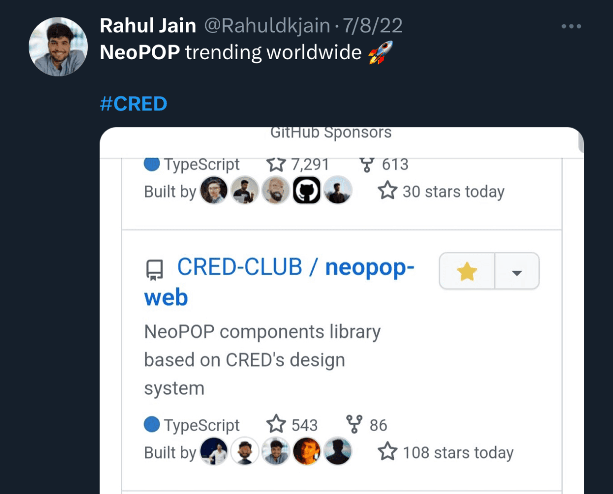
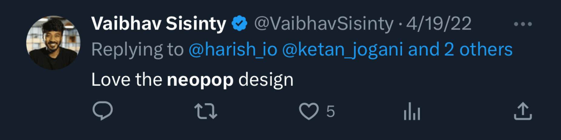
the over all response was so great that we open sourced neopop on github! ✌️
I wonder how well we would have relatively collaborated if the lockdown didn't happen. I'm guessing better. 💭
something i learnt from this experience, always create champions rather that challengers in the system. it's us vs the world. 🏆
nice things that happened for me because of this project, I got promoted. Also got inducted into the design council. 😁
Skills i sharpened through this project, management & cross team collaboration. 🤝
this has been one of the most rigorous & fun projects I've worked on.
From this roller coaster project
reflections & learnings
Here's just a little more NEOPOP for you!
Thanks for watching till the end
one last thing
browser AUTOPLAY restriction
select the window • hover to play